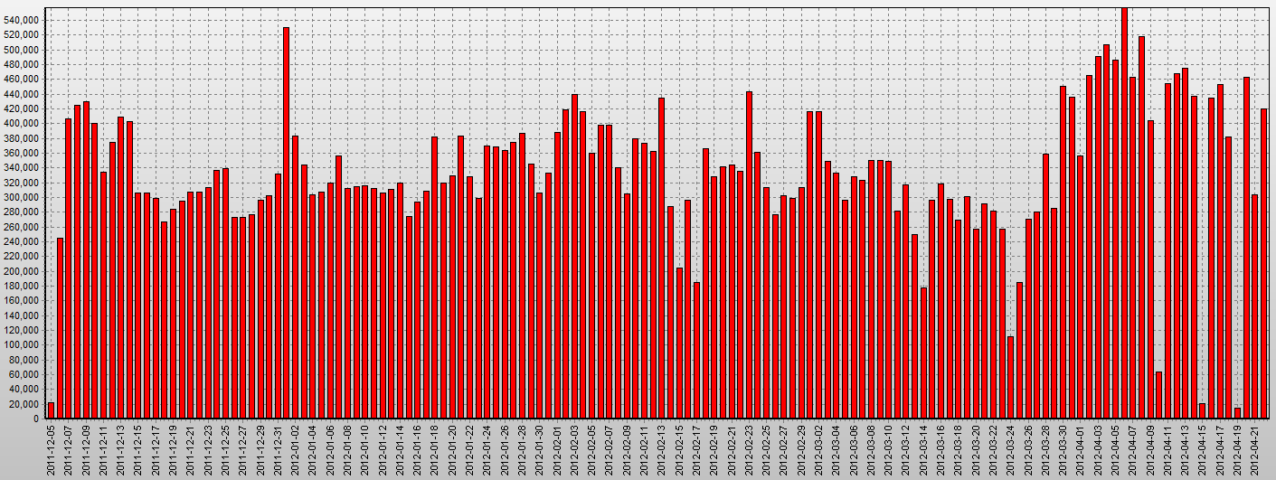
Figure 1. Daily counts of calls.
This paper [pdf] reports on the analysis results for the 2013 Orange D4D challenge data set, CDR mobile phone data from the Ivory Coast.
Slides: [pdf]
Abstract. We consider the D4D fine resolution call data records set from multiple perspectives. We evaluate the properties of the data that restrict potentially applicable movement data analysis methods. We study spatio-temporal patterns of calling activities at multiple resolutions of time. To identify different kinds of activity neighborhoods and their spatial distribution, we characterize antennas by feature vectors of hourly activities within a week and cluster them by similarity. To identify peak events, we compare time series comprising counts of distinct phone users per time interval and antenna. We use trajectories of mobile phone subscribers for reconstructing flows between major activity regions. Finally, we attempt at semantic interpretation of individuals’ personal places.
On this page you can access high-resolution versions of the figures contained in the paper.
Figure 1. Daily counts of calls.

Figure 2. Space-Time Cube displaying the full 20-week data set of CDRs integrated into trajectories (sequence of calls with the same user id) with time increasing from bottom to top of the cube. Besides expected daily cycles e.g. in the area of Abidjan one can spot missing days (near the top), and very clearly the distinct pattern of bi-weekly “false trip” movement caused by re-assigning user IDs to different mobile phone users in other parts of the country between data chunks.
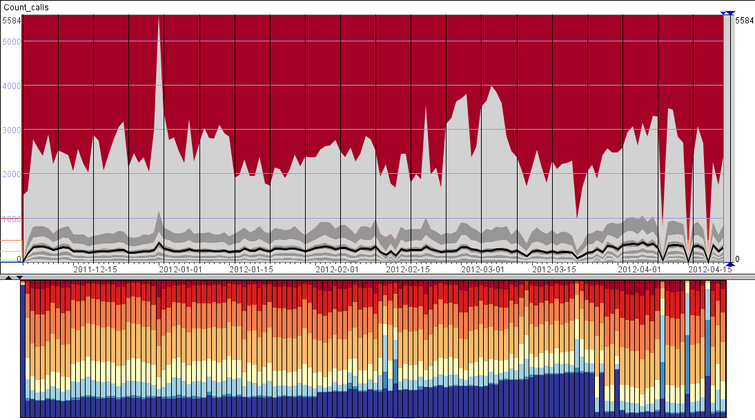
Figure 3. Top: dynamics of deciles of counts of call per antenna distributions. Bottom: daily proportions of antennas with N calls in intervals of 0 (darkest blue), 1..10, 10..50, 50..100 (yellow), 100..200, 200..500, 500..1000, and more than 1000 (darkest red) per day. Note that in the upper image, corresponding interval boundaries are indicated in the scale to the left.
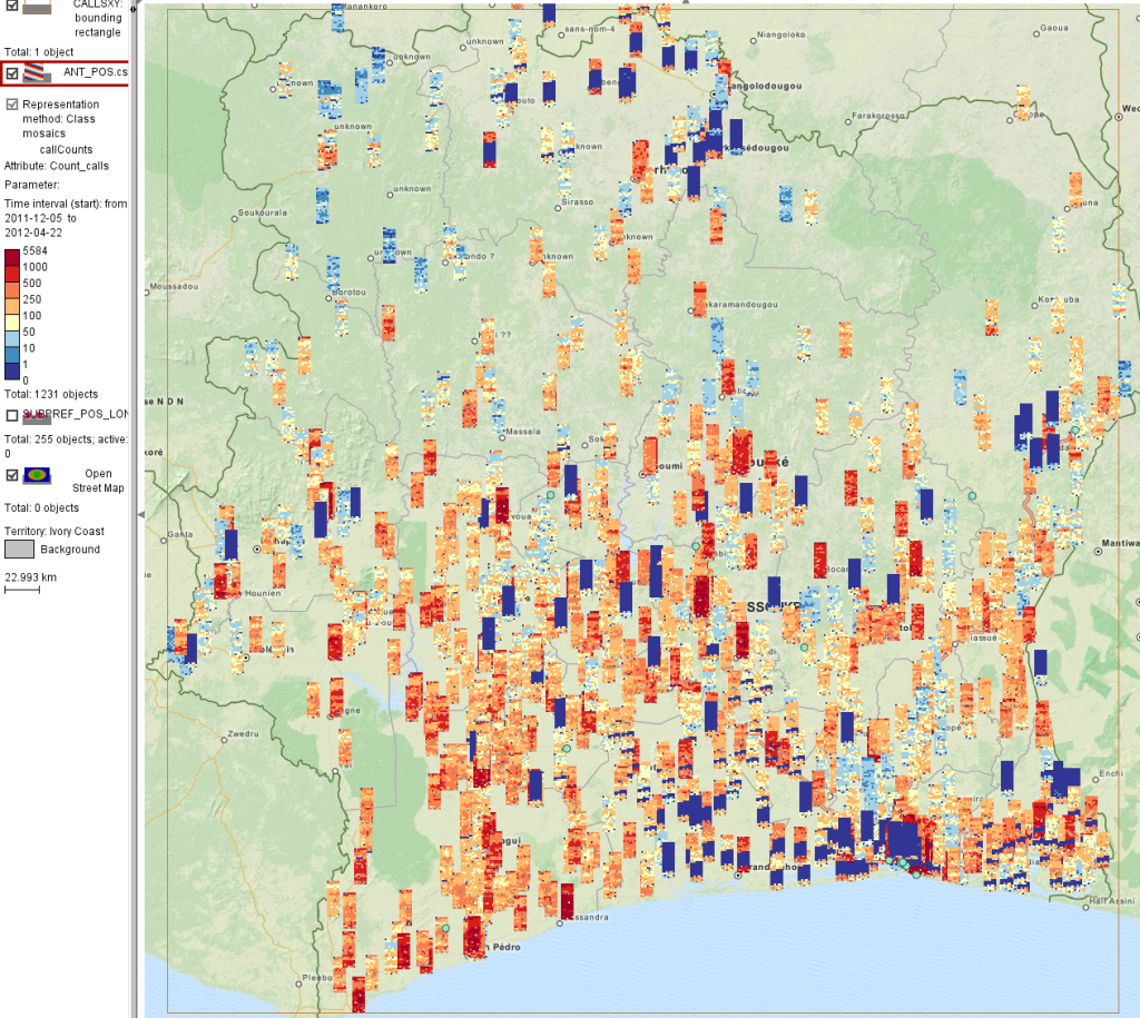
Figure 4. Mosaic (segmented) diagrams show counts of calls for all antennas in the whole country. Counts are represented by colored segments ranging from blue (0 calls) through yellow (50..100 calls) to red (more than 1,000 calls). Diagram rows correspond to weeks (top to bottom – from week 1 to week 20) and columns to days of week (left to right: from Monday to Sunday).
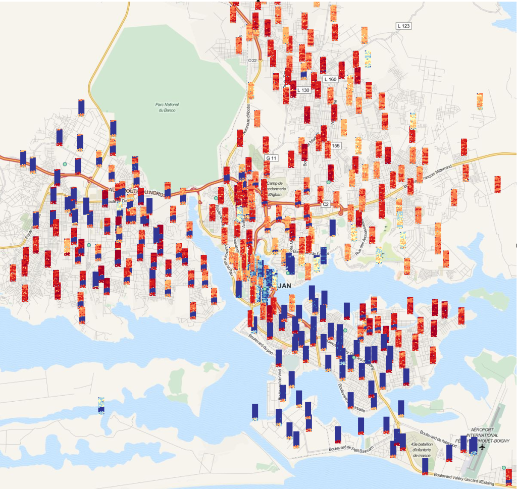
Figure 5. Close-up view of the region of the towns Abidjan and Abobo. The mosaic diagrams are encoded in the same way as in Figure 4 and use the same color coding.
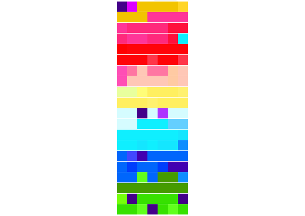
Figure 6. Similarity of situations during 7 days x20 weeks, represented by assigning colors to segments of the diagram according to the cluster the corresponding day belongs to.
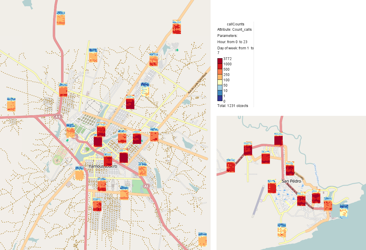
Figure 7. Mosaic diagrams show hourly absolute counts of calls for 7 days of week (by columns, from Monday to Sunday) and 24 hours of day (from 0:00 to 23:00) in Yamoussoukro and San Pedro.
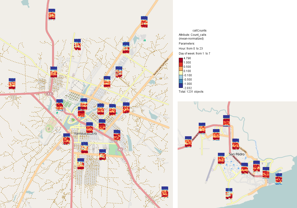
Figure 8. Similarly to Figure 7, mosaic diagrams show hourly show counts of calls for 7 days of week (by columns, from Monday to Sunday) and 24 hours of day (from 0:00 to 23:00) normalized by average count per antenna in Yamoussoukro and San Pedro.
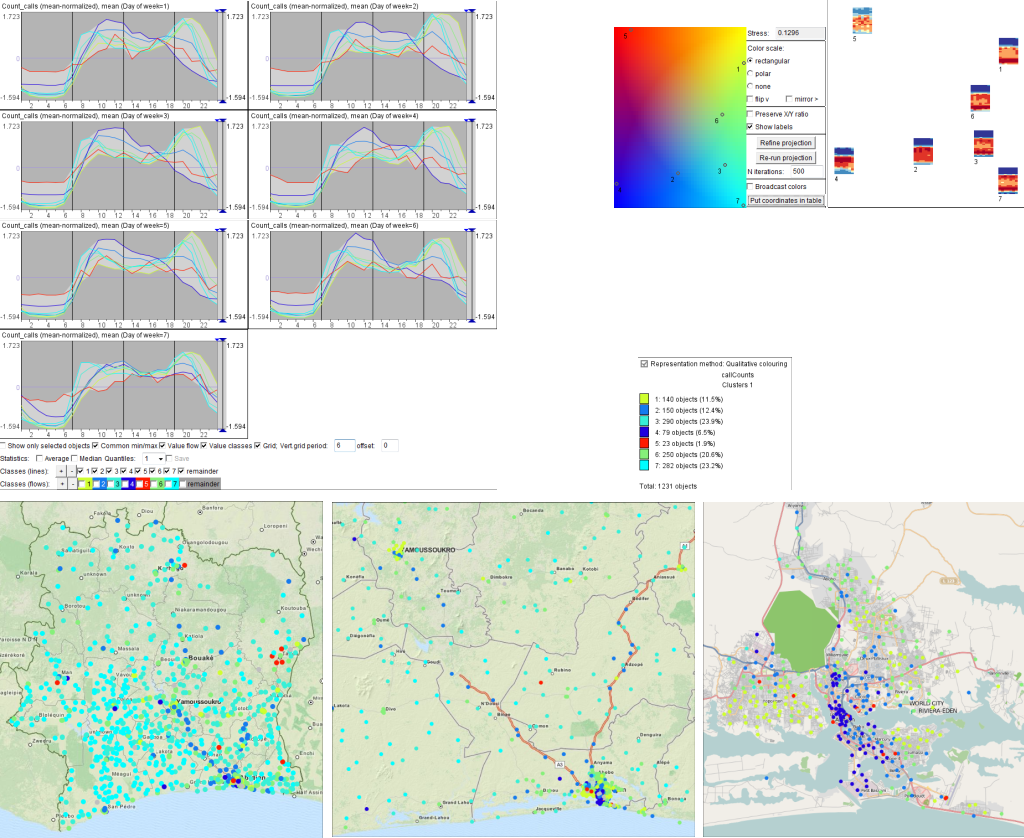
Figure 9. Normalized temporal signatures of antennas are used for defining 7 clusters by k-Means. Time graphs in the top-left show profiles of these clusters during 7 days of week. Colors are assigned to the clusters according to positions of cluster centroids in Sammons mapping (top-middle). Representative activity profiles for the clusters are shown by 2D mosaic diagrams in the top-right. The maps at the bottom show spatial distributions of the clusters for the whole country (left), south-west part (center) and the region around Abidjan (right).
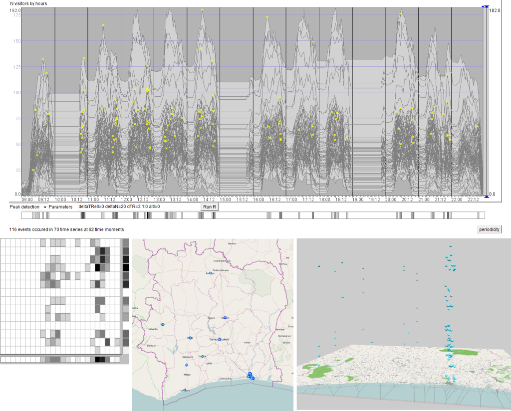
Figure 10. The time graph at the top shows time series of counts of mobile phone users grouped by antennas, at 1 hour resolution. Peaks with magnitude of at least 20 users over 3 hour intervals are marked by yellow crosses. Counts of peaks are shown in 2d periodic event bar at the bottom-left. Positions of peak events are shown on the map of the country in the bottom-center map and in the space-time cube at bottom-right.

Figure 11. Peaks that happened at 21:00 on the 2nd week’s Saturday and their containing time series are highlighted in the time graph (left). Simultaneously, their positions are marked on the map (right).
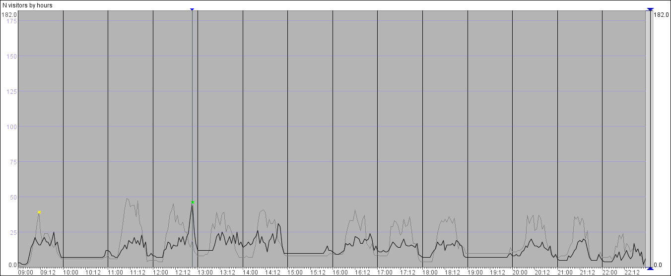
Figure 12. Peaks on Monday morning (yellow cross) and Thursday evening (green cross) are shown on top of two time series with otherwise usually low presence of calling activities. Both peaks have happened in Abidjan.
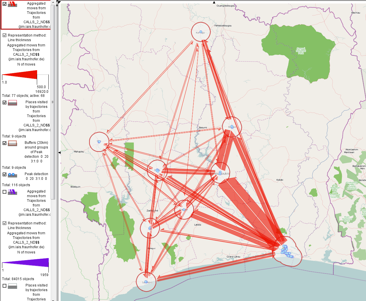
Figure 13. Flows between regions that correspond to peaks in people presence.
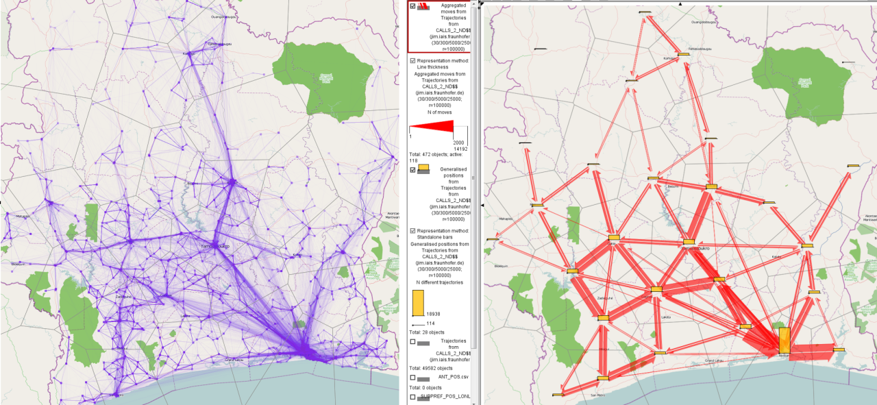
Figure 14. All trajectories during last two weeks drawn as accumulation of semi-transparent lines (left). Trajectories are summarized by 28 aggregated regions (Voronoi polygons) of approximately 100km radius. Flows between regions are represented by red arrows with flow magnitudes encoded in the arrow width. Counts of mobile phone owners registered in each area are shown by yellow bars.

Figure 15. Individual locations of repeated activities are shown by 500m buffer polygons for subscriber #548709. Hourly temporal signatures (according to hours of day) are shown by time flow diagrams. Spatio-temporal positions of calls are shown in the space-time cube. Red dots represent home-based calls, blue dots correspond to the person’s work place, and prurple to the primary location of her evening activities. Gray dots in the space-time cube represent irregular activities.
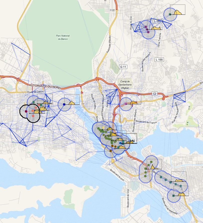
Figure 16. Locations from other trajectories characterized by temporal profiles similar to that was identified as work in Figure 15.