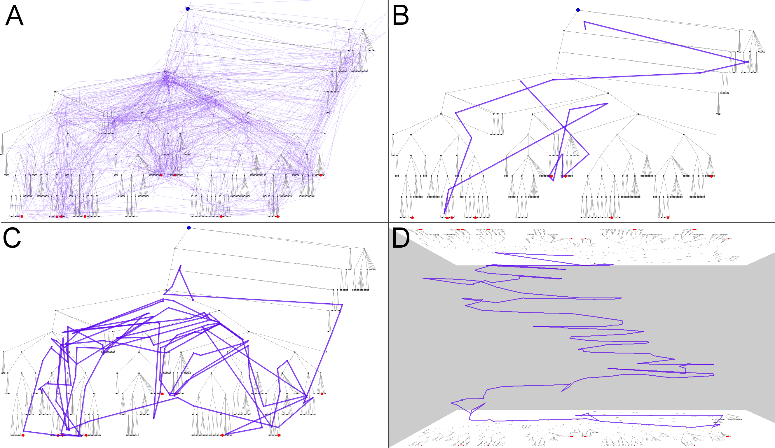
The figures are given in the order in which they are described in the text of the paper. Figure 1 appears on the first page of the paper as a teaser, but here it is placed after Figure 6.
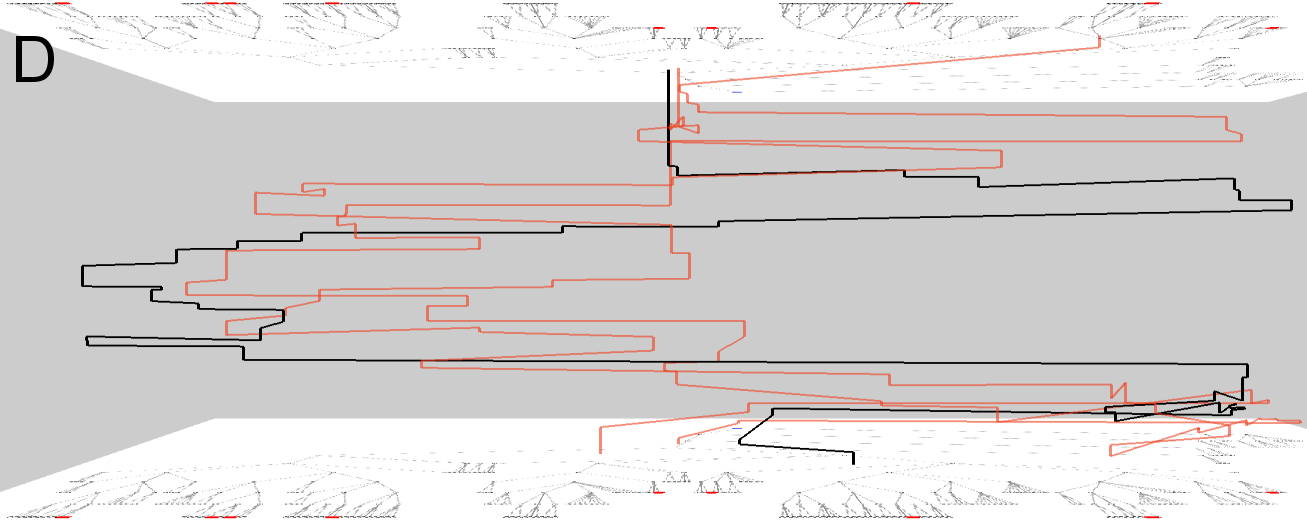
Trajectories can be shown as lines on a map display where the visual stimulus serves as a background. Reducing the opacity of the lines decreases display clutter and exposes concentrations of movements (Fig. 2A). This display may be useful for examining one selected trajectory when its shape is relatively simple (Fig. 2B) or for comparing two simple trajectories but the effectiveness quickly decreases as the shape complexity increases (Fig. 2C).
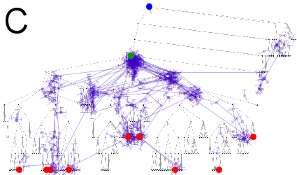
A space-time cube (STC) display can partly “disentangle” a complex trajectory (Fig. 2D). In a space-time cube, two dimensions are used to represent space and the third dimension time. A map is drawn in the base of the cube. Trajectories are represented in a space-time cube as three-dimensional lines. Showing a large number of trajectories simultaneously makes the display illegible. Therefore, STC is more suitable
for exploring a few trajectories. A drawback of STC is that the spatial positions of the fixation points are not immediately clear and may only be identified using special interaction techniques.
Projection and clustering of eye trajectories by similarity. A: a two-dimensional projection (Sammon's mapping) of the set of trajectories built according to the matrix of distances (dissimilarities) between the trajectories estimated using the distance function "route similarity". The trajectories are represented by dots. The dot in the lower left corner is very distant from all others. B: a new projection has been built after removing the outlier. The projection space has been divided into areas that define clusters of relatively similar trajectories. Different colors have been assigned to the clusters. C: a condensed table view of the attributes of the eye trajectories (specifically, track length and duration) where the rows are colored according to the cluster membership of the trajectories. D: a space-time cube with trajectories from one of the clusters.
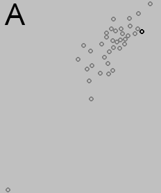
The distance function "route similarity" is applied to create a matrix of pairwise distances between the trajectories, which is used to generate a two-dimensional projection of the set of trajectories by means of multi-dimensional scaling (MDS) or Sammon’s mapping. The projection can expose one or a few outliers. Fig. 3A represents a two-dimensional projection (Sammon's mapping) of the set of trajectories used as the running example. The projection plot contains a point that is very distant from the remaining points, which means that the corresponding trajectory is very dissimilar to all others. This is the trajectory seen in Figs. 2C and 2D. It is reasonable to filter out the outlier(s) and apply the projection tool to the remaining trajectories; so we did in our example and obtained a new projection shown in Fig.3B. Then the trajectories are grouped according to their proximity in the projection space. One of the possible ways to do this is by Voronoi tessellation of the projection space (Fig. 3B); the seeds may be chosen automatically and/or interactively. The projection is also used to assign different colors to the groups of trajectories. Then any of the groups can be chosen for viewing in an STC (Fig. 3D) and on a map. In this way, the intra- and inter-group variation can be estimated.
Figure 3D shows a group of three trajectories that is rather compact in the projection space (it is located on the top right in Fig. 3B); one trajectory is highlighted in black (the corresponding points are also highlighted in the projection plots). Time adjustment to the common start and end has been applied to the trajectories to facilitate the comparison. The scanpaths are similar in that the eyes first moved from the center to the right, then to the left, then again to the right, and returned to the center. Yet, there is also much diversity, which is even higher in the other groups. The differences between the groups are also high. The projection stress coefficient may also be indicative of the level of variation. In our example, the coefficients are very high (0.346 in projection A and 0.312 in projection B), indicating high variation.
Groups of trajectories can be further explored using other displays. Thus, Fig. 3C shows a table lens display of the scanpath lengths and durations; the rows are sorted by increasing duration. The dark row corresponds to the highlighted trajectory. It is seen that the upper right corner of the projection B (colored in shades of red) includes shorter and faster trajectories than the lower left corner (cyan). The white bar at the bottom of the table represents the outlying trajectory (Figs. 2C and 2D), which has been removed after the first application of the projection. This trajectory is much longer and slower than all others.
Automatically generated Voronoi tessellation of the image space for generalization and aggregation of eye trajectories. The eye fixation points are shown by green hollow circles. The black circles represent the generating seeds for the Voronoi polygons.
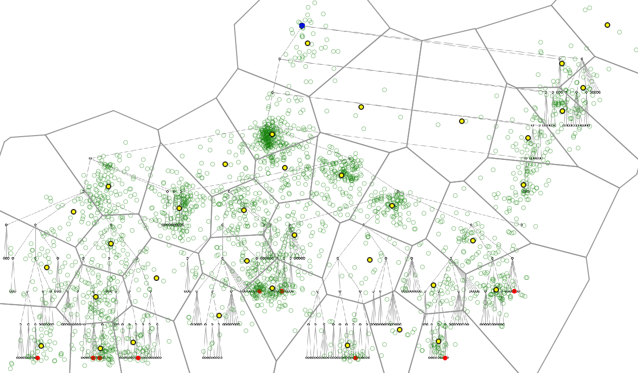
Discrete spatio-temporal aggregation requires representing the space as a finite set of places, which can be done by means of space tessellation as exemplified in Figure 4. The partitioning is generated automatically on the basis of the spatial distribution of the fixation points (the method groups the points into spatial clusters of a limited spatial extent specified by a parameter and then takes the cluster centers as generating seeds for Voronoi tessellation). In Fig. 4, the fixation points are shown by green hollow circles. The black circles represent the generating seeds for the Voronoi tessellation. The cell sizes, which are regulated by a method parameter, determine to what extent the data will be generalized and aggregated. It is advisable to try several parameter values to obtain a suitable level of abstraction and good conformity to the content of the stimulus.
A summary map of eye movements. The green circles represent the total time spent in each place by proportional sizes (circle areas). The places are connected by flow symbols (in violet) varying in widths proportionally to the counts of eye moves between the places. For better legibility, the flows representing fewer than 3 moves have been filtered out.
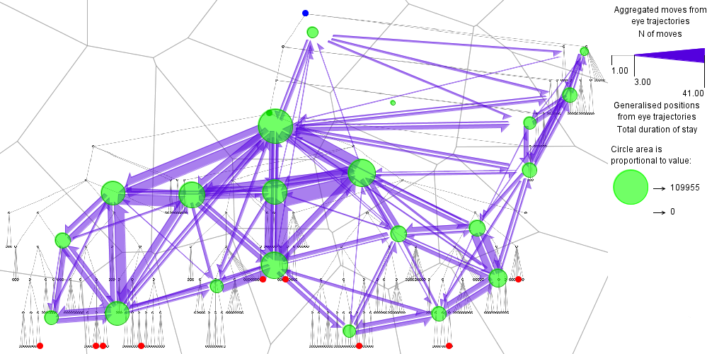
Figure 5 gives an example of summary map resulting from spatial aggregation of multiple scanpaths. As described earlier, aggregation produces two sets of summary attributes: related to places (i.e., generalized positions) and related to connections between the places. Place-related attributes can be visualized on a map display by coloring or shading of the areas or by diagrams. In Fig. 5, the total time spent in each place by all users is represented by the proportional size of the green circle. Connection-related attributes can be visualized using the flow map technique, in which places are connected by special flow symbols varying in widths proportionally to the attribute values. Flow symbols may have the form of a half of an arrow pointing in the direction of the movement, to enable representing opposite flows. In Fig. 5, the widths of the flow symbols represent the total counts of moves between the places. For better legibility, the flows representing fewer than 3 moves have been filtered out. Still, there are many intersections among the flow symbols, which clutter the display. This is a consequence of the discontinuous, inertialess character of eye movements: the flows reflect eye jumps from place to place without attending intermediate places. Unfortunately, clutter reduction by means of edge bundling would introduce too much distortion, which can be misleading. The view can be made clearer by focusing on subsets of flows selected according to the magnitude, length, origin, destination, and/or direction.
Figure 5 demonstrates that summary maps can support many of the movement-focused tasks, including comparative analyses. Given below are examples of observations that can be made.
General character of the movement: There are short and long moves while shorter moves are more frequent. The flows where the move counts are bigger than the number of the users indicate repeated moves (other flows representing repeated moves can be found by visualizing the average number of moves per user).
Spatial patterns of the movements: The movements are spatially dispersed rather than clustered. There are both jumps across large areas and short moves indicating gradual scanning.
Relation of the movements to the display content and/or structure: Many of the moves follow the links of the tree diagram. There are also moves from one group of leaf nodes to another along the diagram perimeter. These can be explained by searching for marked leaf nodes. Generally, the spatial pattern of the movements corresponds to the tree structure.
Relation of the movements to particular AOIs: In our example there are predefined AOIs: the marked leaf nodes, the tree root, and the target node (solution), which was initially unknown to the users and needed to be found. These three classes of AOIs are represented by red, blue, and green dots, respectively. The summary map shows that the eyes moved between the marked leaves and the target node following the tree structure.
Flow maps summarizing eye movements by time intervals. The length of each interval is 10% of the task fulfillment time. For clutter reduction, only the flows representing at least two moves are shown.
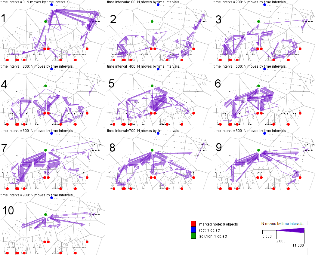
Figure 6 shows a temporal sequence of summary maps for our running example. Before the aggregation, the trajectories have been aligned to the same start and end times; hence, we consider relative time intervals with respect to the whole duration of the task fulfillment. This time has been divided into 10 equal intervals; hence, each of the maps represents a time interval of 10% length of the task fulfillment time. The movements in each interval are visualized using the flow map technique. For clutter reduction, only the flows representing at least two moves are shown.
The maps tell us that in the first 10% of the time the users mostly moved their eyes from the center of the display towards the periphery and also along the periphery. Movements along the periphery prevailed in the next 10% of the time. In the next two intervals the users explored the subtrees containing the marked leaves (red dots), and in intervals 5-7 much movement between the marked nodes and the solution (green dot) occurred. Many eye movements were related to the two marked nodes in the middle of the tree. Being spatially close, these nodes belong to different tree branches. Evidently, some effort was needed to figure out where each node belongs and to trace the branches to their common origin. In intervals 8-9 the users focused on the side branches, including the ones on the top right having no marked nodes. Possibly, the users checked if any marked node was there. In the last 10% of the time most movements were to and from the target node. Note that movements to and from the root (blue dot) occurred only in the first time interval. They might be a part of the process of tracing the tree perimeter.
Hence, we could find several types of activities: tracing the tree perimeter, exploring subtrees (the movements do not necessarily follow the tree links but rather cross or encircle the subtrees), tracing branches (by following the links), and checking the candidate solution (by moving from it in different directions).
Flow maps of summarized eye movements by time clusters. The backgrounds of the map captions are painted in the colors assigned to the clusters. The colored segmented bar at the botom is a time line, which shows the temporal positions and extents of the time clusters. The widths of the flow symbols are proportional to the average counts of eye moves computed for the time clusters. For better legibility, the symbols corresponding to the mean values below 0.5 have been hidden.
Below is another screenshot of the same small multiple flow maps display with a different layout of the maps. The layout is automatically adjusted to the current size and proportions of the window containing the display.

The goal of this analysis is to divide the whole time of task fulfillment into intervals so that the intervals correspond to different kinds of activities. For this purpose, the data are aggregated by small time intervals (e.g. 1% length of the task fulfillment time). Then the combinations of time-dependent attribute values associated with the connections (flows) between the places are taken as feature vectors describing the time intervals. Thus, for each time interval and each connection there is a corresponding count of eye movements. The vector consisting of the counts for all connections is taken as the feature vector of this time interval. These feature vectors are used to cluster the small time intervals. Several consecutive small intervals having similar feature vectors will be united into longer time intervals. However, non-contiguous time clusters can also be obtained. This may mean that different types of activities are not performed in a strict order or in the same order by all users.
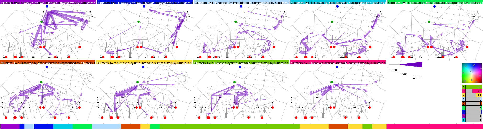
In Fig.1, we have aggregated the data by time intervals of 1% of the task fulfillment time. Then we applied k-means clustering algorithm to the vectors of the move counts corresponding to the time intervals. For the clusters of time intervals we have generated small multiple flow maps representing the average counts. We tested different values of the parameter k (number of clusters) for obtaining well discriminable and interpretable spatial patterns. Figure 1 shows the results for k=9. Lower values of k mix some of the patterns observable in Fig.1 and higher values reveal finer differences, which are not important in the context of this paper. The colored caption of each map in Fig.1 signifies the time cluster represented by the map (the colors have been obtained by projecting the cluster centers onto a two-dimensional color space as illustrated on the right). The temporal positions of the clusters are shown by the segmented bar at the bottom of the figure. The sizes (i.e., total durations) of the time clusters are given in the table in the lower right corner.
Figure 1 demonstrates clearer spatial patterns than we saw in Fig. 6. We can not only recognize the different activities performed by the users but also estimate the relative time spent for each type of activity:
Summary maps of attention distribution by time clusters. The backgrounds of the map captions are painted in the colors assigned to the clusters. The colored segmented bar at the botom is a time line, which shows the temporal positions and extents of the time clusters. The sizes of the circles are proportional to the mean counts of different users that focused their eyes within the generalized places.
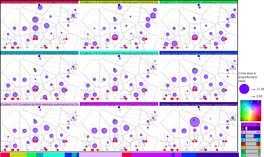
The spatial patterns of users’ attention can be explored analogously to the spatial patterns of the eye movements. Aggregate attributes related to the generalized places (e.g. cells of space division) are visualized on small multiple attention distribution maps by coloring or shading of the areas or by symbols or diagrams placed in the areas. In Fig. 7, the average counts of different users who attended the places (i.e., focused their eyes within the places) are represented by circles with proportional sizes (areas). The counts have been summarized by time clusters obtained by clustering of the time intervals by similarity of the attention distribution: the clustering algorithm has been applied to the feature vectors composed of the user counts by the places and time intervals of 1% of the task fulfillment time. In Fig. 7 we see that at the beginning most users looked in the middle of the tree diagram and at the root, then their attention switched to the leaves, then they focused more on the marked leaves, then the attention foci gradually moved to the upper tree levels until converging at the target node.
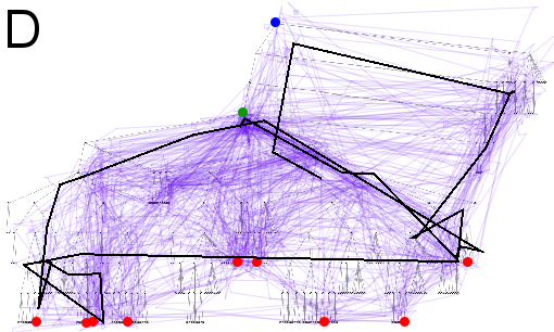
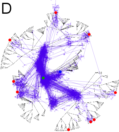
Analysis of attendance of particular AOIs. A: temporal view of eye trajectories. The horizontal dimension represents time. The segmented bars represent the trajectories aligned to common start and end times. The segments are colored according to the distances to the selected points of interest. B: the effect of the segment filtering on the map display of trajectories. Visible are only the points and segments of the trajectories that satisfy the filter. C: a scatterplot of the count of events extracted from the trajectories (vertical dimension) against the track duration, i.e., task fulfilment time (horizontal axis). D: the trajectory close by its shape to the optimal path is highlighted in the map display.
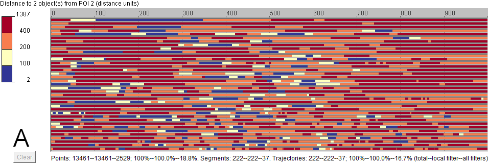
Earlier we have noticed much scanning related to the two marked leaves in the center of the tree diagram used as the running example. Examining these nodes and their links was, in fact, not needed for the task fulfillment. An optimal strategy would be to trace the paths from the leftmost and rightmost marked leaves upwards and ignore the marked nodes between them. To investigate how many users and how often attended the two task-irrelevant nodes, we use the temporal view of trajectories shown in Fig. 7A. The horizontal dimension represents the time. As before, the times in the trajectories are aligned to common starts and ends; the units are per mille (i.e., thousandths) of the task time. The scanpaths are represented by segmented bars sorted from top to bottom by ascending track duration. The bar segments are colored according to the distances of the corresponding trajectory points to the selected AOIs (i.e., to the nearest of the two marked leaves in the center). The range of the distances is interactively divided into intervals, which are assigned distinct colors. Note that the color encoding is non-linear. Dark blue represents distances up to 100 pixels. Dark blue segments occur almost in all trajectories, often several times. Hence, almost all users attended the selected AOIs and their vicinity. There were more visits at the beginning and in the middle of the task fulfillment time than at the end.
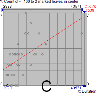
For a more precise investigation, we apply event extraction. The legend on the left of the temporal view (Fig. 7) is at the same time an interactive device for filtering. By clicking on the colored rectangles, we apply segment filtering to filter out the segments corresponding to the distances over 100. This affects the map (Fig. 7B): we see only the points and segments of the trajectories that satisfy the filter. By interactively moving the interval break, we can regulate the extent of the area around the selected AOIs considered as their neighborhood. The segments satisfying the filter can be treated as events [4]. Statistics of these events can be computed and attached to the trajectories: event count, total event duration, start time of the first event, and end time of the last event. The statistics show us that only four users did not attend the neighborhood of the selected AOIs and the remaining 34 users attended it from 1 to 7 times; both mean and median are 3. The scatterplot in Fig. 7C visualizes the event count (vertical axis) against the track duration (horizontal axis).
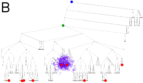
We iteratively select the trajectories that had no events of coming close to the selected AOIs to check whether they used the theoretically optimal strategy. The trajectory highlighted in black in Fig. 7D (as well as in Fig. 3) is the closest to the optimal path and has the second best task fulfillment time; the other three trajectories include many unnecessary movements. The highlighted trajectory includes a jump from the vicinity of the rightmost marked leaf to the left side of the tree without attending the marked nodes in between. Later the user moved from the leftmost marked leaf to the target node, from there to the rightmost marked leaf, and then returned to the target. These moves comply with the optimal strategy. Several moves at the beginning can be interpreted as familiarization with the tree: center – root – top right corner – along the periphery towards the rightmost marked leaf. However, the user did not come directly to this leaf but first made a couple of moves in the vicinity, which may indicate visual search rather than quick and easy noticing. Similar behavior is observed at the left side of the tree. The attendance of the second and third marked leaves from the left was not needed for task completion. Probably, the two closely located marks were more prominent than the leftmost mark and thus attracted user’s spontaneous attention before the relevant leaf could be found. Hence, it is quite probable that this user did try to apply the optimal strategy but had to search for the relevant marked nodes. The other scanpaths do not exhibit the triangular shape of the optimal strategy.
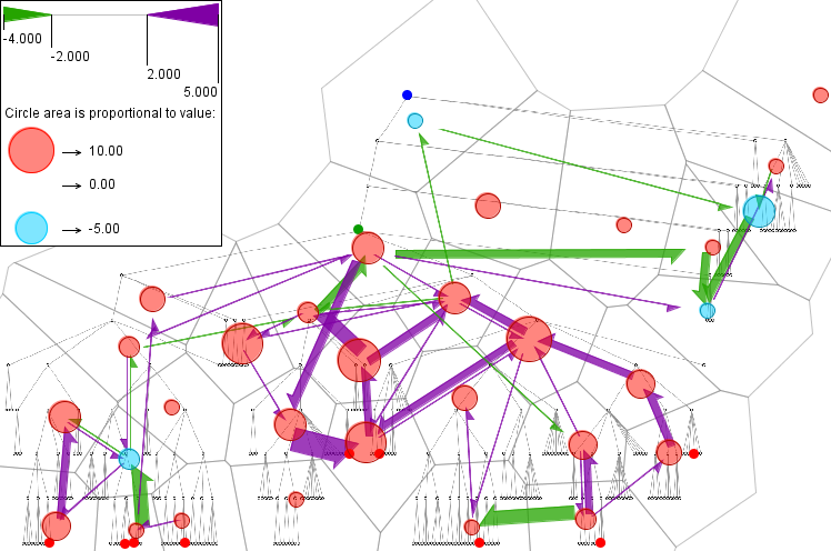
A combined flow map and attention distribution map showing differences between two user groups: the counts of place visits and eye moves between the places for user group 1 have been subtracted from those for user group 2. The positive and negative differences are shown by symbols in different (opposite) colors. For the counts of eye moves, the positive differences are shown by flow symbols in violet and negative in green. The widths of the flow symbols are proportional to the absolute values of the differences. The flows where the absolute differences are less than 2 are hidden for better display legibility. For the counts of place visits, the positive differences are shown by circles in red and negative in cyan. The sizes (areas) of the circles are proportional to the absolute values of the differences.
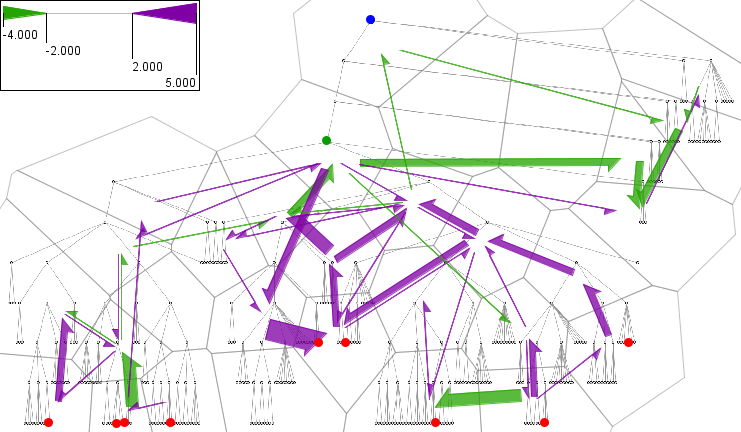
The images below show the flow map and attention distribution map separately (not included in the paper):

The flow symbols in violet and circles in red tell us that the users from group 2 made more eye movements and fixations in the middle part of the tree diagram than the users from group 1. As we discussed before, the middle part of the tree is not relevant to fulfilling the task given to the users. The fastest user group paid less attention to this task-irrelevant part, which can explain their better performance. The flow symbols in green and circles in cyan tell us that the users from group 1 paid more attention to the tree branches on the top right, which do not contain marked leaves and therefore are also not relevant to the task. It is interesting that the flows are directed from the center or root of the tree to the top right and clockwise from the top right corner along the tree periphery. This may signify a systematic overview of the tree diagram and/or systematic search for the marked leaves.
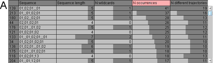
Returns to previous trajectory points for a tree diagram with traditional top-down layout. A,B: temporal views of trajectories for the traditional (A) and radial (B) tree layouts. The horizontal dimension represents the time of task fulfillment. The segmented bars representing the eye trajectories are ordered by increasing duration of the task fulfillment. The segment colors represent the distances to the nearest of the previous trajectory points such that the travelled path from these points is not shorter than a chosen threshold of 100 pixels. C,D: results of segment filtering for the traditional (A) and radial (B) tree diagrams. Only the points of the trajectories whose distances to the previous points are less than 25 pixels are visible on the map displays. The lines connect consecutive points satisfying the filter.

To assess in more detail how often the users returned to previous fixation points, we use the temporal view of trajectories, as in Fig. 7A, in which we visualize the distances to the nearest of the previous trajectory points such that the travelled path from these points is not shorter than a chosen threshold (e.g. 100 pixels). Figures 9A shows these distances for the tree diagram considered so far. For comparison, Figure 9B shows the same information for an equivalent tree diagram with radial layout. The bars representing the trajectories are ordered by increasing task duration. Dark blue encodes distances below 25 pixels. In Fig. 9A, dark blue is rare at the top of the display but its proportion increases towards the bottom. With the radial layout (Fig. 9B), even the fastest users returned quite many times to previous points and the bars become almost completely blue at the bottom of the display. By setting the segment filter, we can see the repeatedly visited locations in the corresponding maps. Figures 9C and 9D show the trajectory points whose distances from previous points are less than 25 pixels for the two tree diagrams. The lines connect consecutive points satisfying the filter.
By matching the tree structures in the two stimuli, we find out that the hierarchy positions of the frequently re-visited nodes are the same in both diagrams except that there were no returns to the root in the traditional diagram and many returns to the root in the radial diagram. The density of the return points and connecting segments is much higher in the radial diagram. The high density of the segments means that not only the same nodes were re-visited but also the same moves repeatedly made. The repetitions indicate high users’ difficulties.
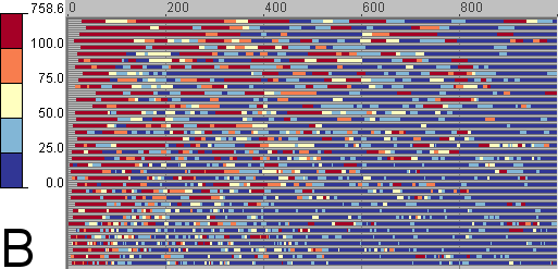
Frequent sequences of visited places discovered by the sequence mining algorithm TEIRESIAS. A: a table display shows 12 most frequent sequences of places and their characteristics (length, number of wildcards, number of occurrences, number of different trajectories in which the sequences occur). The places are referred to by their identifiers. B: the sequences without wildcards are represented as trajectories in a space-time cube. The line thickness is proportional to the frequency (number of occurrences). The trajectories are drawn with 20% opacity; hence, darker shades indicate overlapping of many trajectories. C: the sequences are summarized in a flow map. The width of the flow symbols is proportional to the number of sequences in which the corresponding moves appear. The place identifiers are shown by labels.

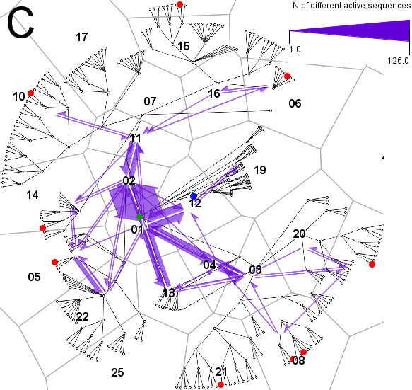
When eye trajectories are generalized by replacing points by areas, they receive additional representations as strings consisting of the area identifiers and suitable for TEIRESIAS. We demonstrate the use of this method by example of the data for the radial tree diagram shown in Fig. 9D. Given the minimum motif length of four and minimum support (number of occurrences) of five, the method finds 230 repeated sequences of the length from 4 to 10, of which 88 do not contain wildcards, 129 include one wildcard, and 13 two wildcards. A wildcard is a special symbol (dot) indicating that an arbitrary symbol may occur in the corresponding position in the sequence. Twelve most frequent sequences are shown in a fragment of a tabular display in Fig. 10A. We see that there were many moves forth and back between areas identified as 01 and 02.
To facilitate the interpretation of the sequences with regard to the structure of the diagram, they are represented as trajectories in the diagram space; the positions in the trajectories are the areas whose identifiers appear in the sequences. All trajectories receive the same start time and equal time intervals between the positions. This approach works well for sequences without wildcards but it is unclear what spatial position could represent a wildcard. Our current provisional solution is duplicating the previous position.
The STC in Fig. 10B shows the trajectories representing the sequences without wildcards (the lines connect the centers of the areas). The line thickness is proportional to the frequency (number of occurrences). The trajectories are drawn with 20% opacity; hence, darker shades indicate overlapping of many trajectories. In Fig. 10C, all sequences are summarized in a flow map. The width of the flow symbols is proportional to the number of sequences in which the corresponding moves appear. The area identifiers are shown by labels. The move from area 01 to area 02 appears in 126 sequences and the opposite move in 114 sequences. To find out a possible explanation for the frequent cyclic movements between these areas, we take a closer look at the diagram and detect an intersection of links, which could cause users’ confusion.