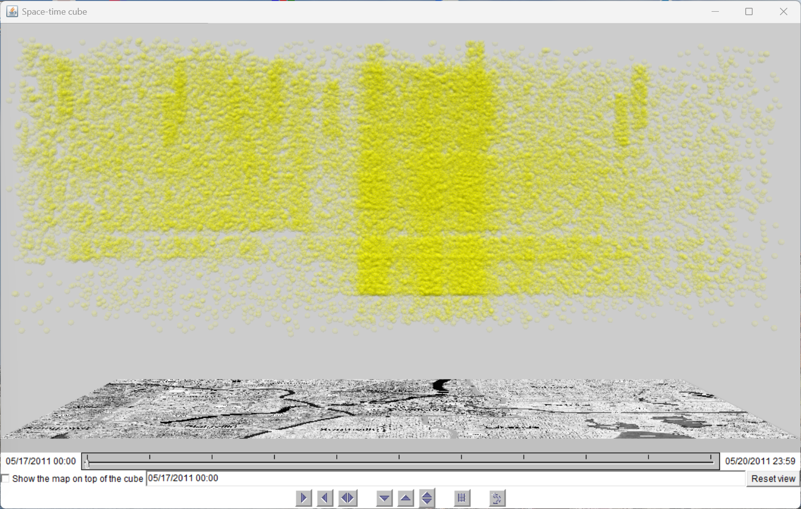
Before applying any clustering, the analyst loads the VAST Challenge 2011 dataset—approximately 1,000,000 simulated microblog messages from the last 4 days of activity in the fictional city of Vastopolis. The map and space-time cube below show the raw spatial and spatio-temporal distributions. At this stage, sickness-related messages are indistinguishable from background noise; the spatial concentrations caused by the contamination event are not yet isolated.
Figure A.1: Map view of all microblog messages (last 4 days). Yellow points represent raw message locations overlaid on the Vastopolis base map. Spatial concentrations are visible but confounded by background activity.
Figure A.2: Space-time cube showing all messages. The horizontal plane represents geography; the vertical axis represents time. The dense mass of points reveals no obvious temporal structure before clustering is applied.
An initial exploratory DBSCAN run with a very broad parameter sweep (ε from 0.05 to 5.0, min_samples = 150) provides a first overview of how the parameter space maps to clustering outcomes. The IteraScope display below shows the resulting quality metrics, Sankey transitions, and 2D embedding—most iterations produce either excessively fragmented results (small ε) or a single giant cluster (large ε).
Figure A.3: IteraScope display for the initial exploratory sweep (ε = 0.05 … 5.0, step 0.05, min_samples = 150). The metrics chart (top) shows that useful structure exists only in the ε = 0.05–0.2 range; beyond that, all messages collapse into one or two clusters. This motivates the narrower sweeps in subsequent rounds.
Based on the initial exploration, the analyst focuses on ε = 0.05 to 1.0 (step 0.05) with min_samples = 150. This round serves Phase 1 of the SI workflow: identifying the coarse structure of the parameter landscape and selecting a promising intermediate value for further refinement.
Parameter
Value
ε (distance threshold)
0.05 … 1.0, step 0.05
min_samples
150 (fixed)
Iterations
20
IteraScope Display
The IteraScope display reveals the full parameter landscape. At ε = 0.05, dozens of tiny clusters are discovered with very high noise percentage. As ε increases, clusters merge rapidly. By ε = 0.25, nearly all messages belong to one or two clusters. The intermediate value ε = 0.10 shows a moderate number of clusters with reasonable silhouette and manageable noise—making it the candidate for domain validation.
Figure A.4: IteraScope display for Round 1 with full metric legend visible (right panel). The metrics chart shows silhouette peaking near ε = 0.10; the Sankey view shows rapid cluster merging beyond ε = 0.15; the 2D embedding (bottom-right) shows groups colour-coded by HDBSCAN archetype.
Figure A.5: IteraScope display (alternative view) showing the bar-chart representation of cluster counts per iteration. The tall bars at low ε values reflect high cluster counts; bars shrink rapidly as ε increases. The scatter plot (bottom-right) shows the relationship between quality metrics across iterations. (This view corresponds to Fig. 2b in the paper.)
Domain Validation: Map and Space-Time Cube
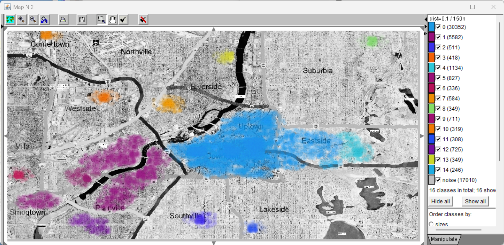
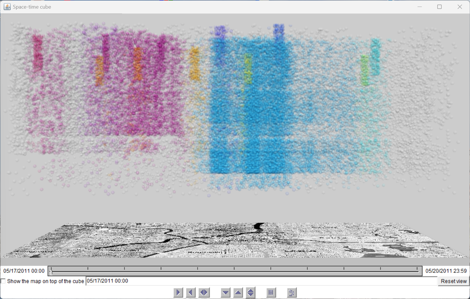
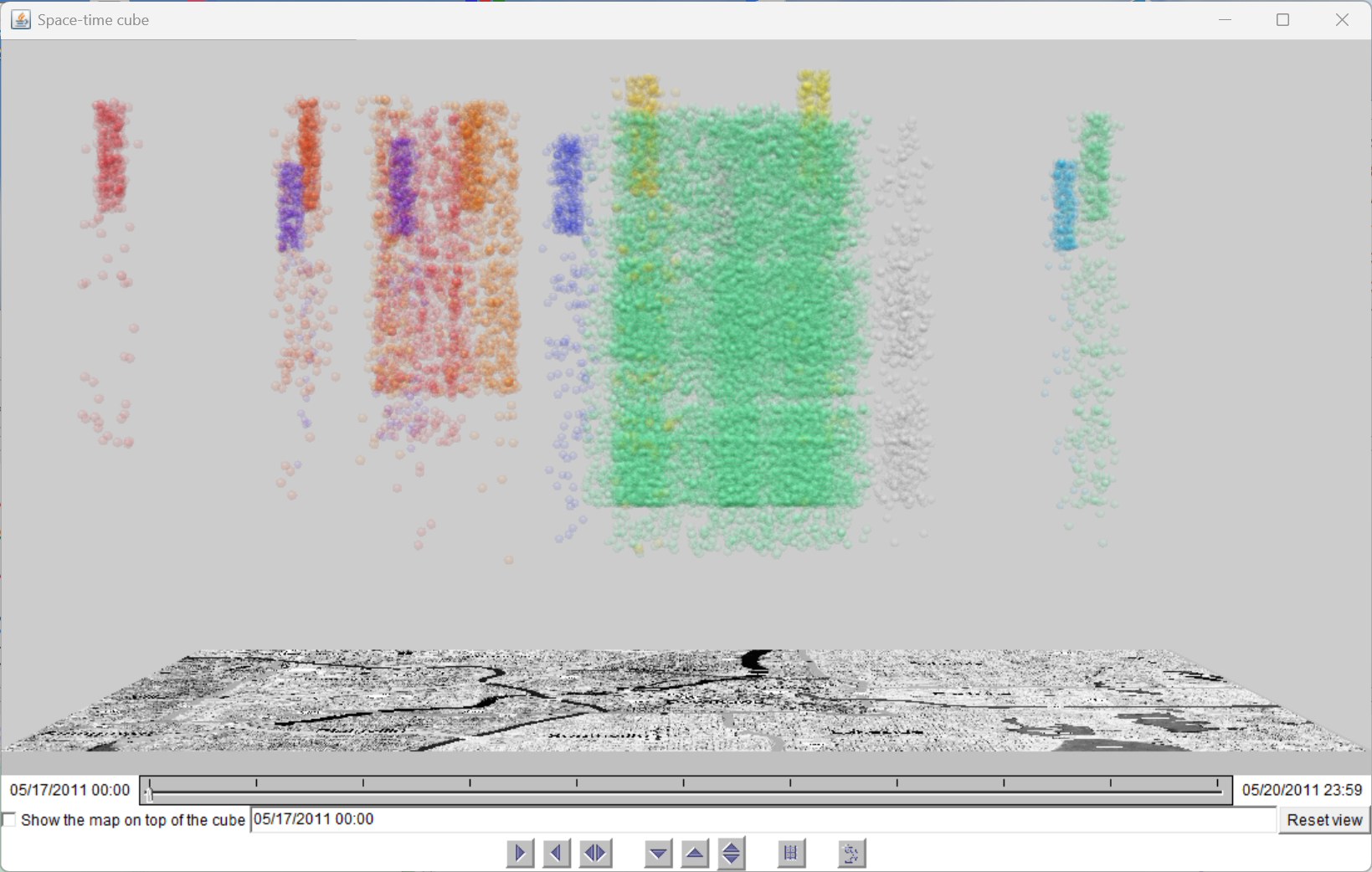
Sharing the ε = 0.10 grouping to the map and space-time cube confirms the spatial and temporal validity of the discovered clusters. On the map, clusters align with hospitals, the river corridor, and downwind neighbourhoods. In the space-time cube, temporal layering becomes visible: day 1 shows scattered noise, days 2–4 show spatially extended clusters, and hospital clusters appear only on days 3–4.
Figure A.6: Map showing all discovered clusters at ε = 0.10, including noise (grey). Colour-coded clusters align with known city landmarks—hospitals (tight clusters), river corridor (elongated), and downwind areas (diffuse).
Figure A.7: Space-time cube showing clustered messages at ε = 0.10. Colour encodes cluster membership. Temporal structure is visible: clusters form vertical pillars spanning days 2–4, while day 1 (bottom) contains only scattered noise.
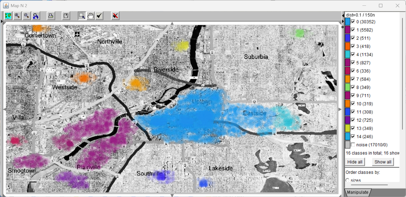
A second map/space-time cube view shows the clustering result with noise removed, isolating only the identified clusters for clearer inspection of their spatial and temporal extent.
Figure A.8: Map showing only clustered messages (noise removed) at ε = 0.10. The spatial structure of the contamination event is now clearly visible: tight hospital clusters, elongated river-corridor clusters, and diffuse wind-dispersed clusters.
(Corresponds to Fig. 2a, top, in the paper.)
Figure A.9: Space-time cube without noise. The temporal layering is now unambiguous: large clusters span days 2–4 (wind/water contamination), while hospital clusters appear only on days 3–4 (delayed medical response).
(Corresponds to Fig. 2a, bottom, in the paper.)
Guided by Round 1, the analyst narrows the distance range to ε = 0.05 … 0.15 (step 0.01) to find the optimal distance threshold with finer resolution. This round corresponds to a refined Phase 1: the analyst seeks the specific ε value where quality metrics peak and cluster structure is most stable.
Parameter
Value
ε (distance threshold)
0.05 … 0.15, step 0.01
min_samples
150 (fixed)
Iterations
11
Domain Validation: Map and Space-Time Cube at ε = 0.07
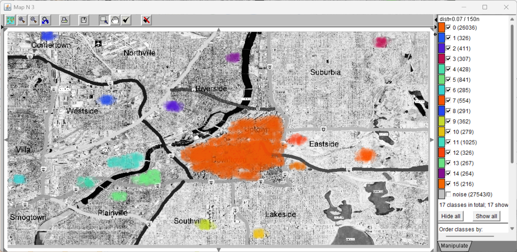
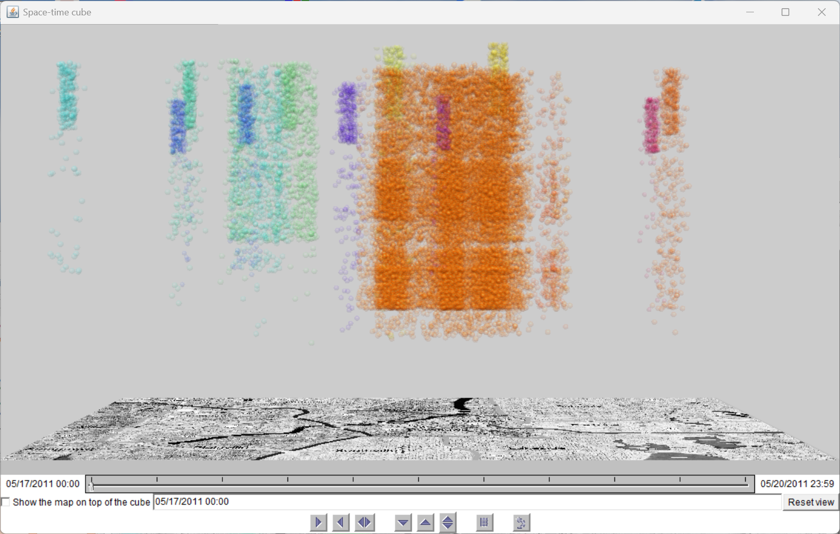
Before examining the IteraScope metrics in detail, the analyst shares the ε = 0.07 grouping to domain views. The map and space-time cube confirm that this value produces tightly delineated clusters with sharper boundaries than ε = 0.10, while retaining all major spatial and temporal patterns.
Figure A.10: Map at ε = 0.07 (noise removed). Hospital clusters are tightly delineated; river-corridor and downwind clusters follow expected elongated geometries with sharper boundaries than at ε = 0.10.
Figure A.11: Space-time cube at ε = 0.07. The same temporal layering persists (noise on day 1, extended clusters days 2–4, hospital clusters days 3–4) but with cleaner temporal boundaries.
IteraScope Display: Finding the Optimal ε
The IteraScope display for the refined sweep provides a detailed view of the ε = 0.05–0.15 landscape. Silhouette peaks sharply at ε = 0.07; Calinski–Harabasz confirms this peak; Davies–Bouldin reaches a local minimum. The Sankey transitions show that the cluster structure at ε = 0.07 persists through ε = 0.08 and 0.09 with only minor boundary adjustments. Several iterations near ε = 0.07 are marked as "complete" (all HDBSCAN archetypes present).
Figure A.12: IteraScope display for the refined sweep. The metrics chart shows clear silhouette peak at ε = 0.07. Complete iterations (dark gridlines) cluster around this value, confirming it as the optimal distance threshold.
Figure A.13: IteraScope with Sankey transitions highlighted. Bands between ε = 0.06 and ε = 0.09 are nearly horizontal—indicating stable cluster composition. The 2D embedding (right) shows groups sitting close to their archetype centroids.
(This view is shown as Fig. 3 in the paper.)
The following views show additional metric perspectives and the tooltip for ε = 0.07, confirming per-group statistics (prevalence, distance to medoid, noise percentage) and archetype membership.
Figure A.14: IteraScope with alternative metric selection. The noise percentage (cool blue line) decreases monotonically but remains substantial—confirming that most background messages are correctly rejected as noise across the entire range.
Figure A.15: IteraScope with tooltip showing detailed metrics for the ε = 0.07 iteration: number of clusters discovered, noise percentage, silhouette score, and archetype count. This iteration is confirmed as "complete" (all archetypes present).
Having fixed ε = 0.07 as the optimal distance threshold, the analyst now sweeps the second parameter—min_samples—from 100 to 200 (step 10) to test robustness of the cluster structure to the neighbourhood-size requirement. This round exercises Phases 2–4 of the SI workflow: transition assessment, confidence evaluation, and domain-contextualised interpretation of borderline members.
Parameter
Value
ε (distance threshold)
0.07 (fixed)
min_samples
100 … 200, step 10
Iterations
11
IteraScope Display: Overview of the min_samples Sweep
The IteraScope display for the min_samples sweep shows that silhouette rises gently from 100 to about 150 and then plateaus, while noise percentage increases steadily. The core cluster structure remains stable across the entire range—the same clusters persist, differing only in how many borderline members they retain versus shed to noise.
Figure A.16: IteraScope display for the min_samples sweep (100–200, ε = 0.07). Silhouette plateaus after min_samples = 150; noise percentage rises linearly. The Sankey view shows near-horizontal bands across all iterations, confirming structural stability.
Figure A.17: IteraScope with Sankey transitions between min_samples iterations. The near-horizontal bands confirm that the same clusters persist across the full range; only the noise group (grey, bottom) grows as min_samples increases.
Figure A.18: IteraScope with violin plots activated. Membership probability is concentrated near 1 for all non-noise clusters, confirming well-separated, confidently assigned members. The noise group shows uniformly low membership, as expected.
Figure A.19: IteraScope 2D embedding detail. Groups from all min_samples iterations cluster tightly by archetype, confirming that the parameter variation does not alter the fundamental group structure—only the noise boundary shifts.
Comparing min_samples = 130 and 150
The analyst decides to compare the two most promising candidates (130 and 150) in detail. He hides all intermediate axes, keeping only 100, 130, 150, and 200 visible. The Sankey view confirms identical core structure; the analyst then focuses on what transitions to noise between 130 and 150.
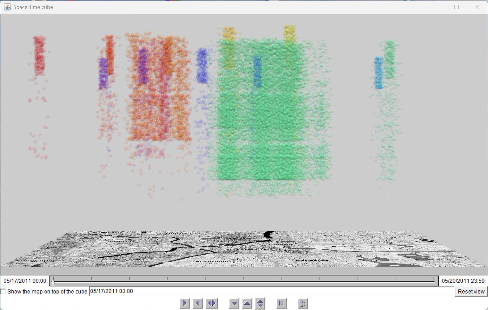
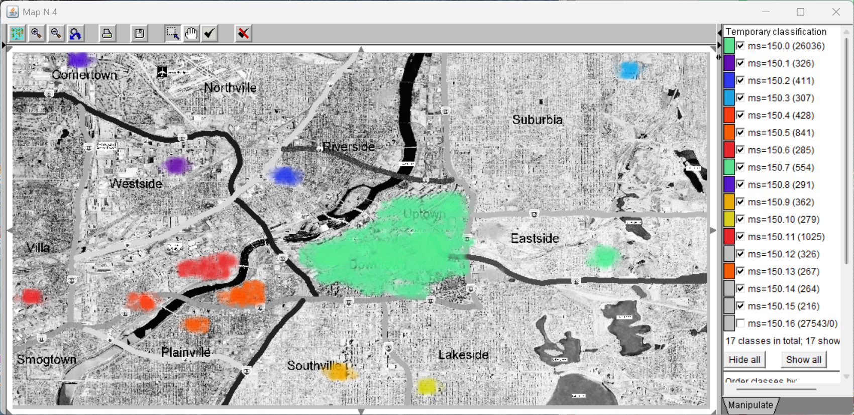
Figure A.20: Map at min_samples = 150 (noise removed). The cluster structure is nearly identical to min_samples = 130, with slightly tighter cluster boundaries.
Figure A.21: Space-time cube at min_samples = 150. The temporal structure is preserved: contamination clusters span days 2–4, hospital clusters span days 3–4 only.
Transition Analysis: What Is Lost Between 130 and 150?
The analyst activates "highlight transitions from" on the noise group at min_samples = 150 to identify which messages were reassigned from non-noise clusters at 130 to noise at 150. This creates a temporary class attribute (e.g., "130.3 → 150.noise") that is propagated to all linked views. The 2D embedding shows connection lines with document counts; the map reveals that these borderline members are located at cluster edges in the city centre and river corridor.
Figure A.22: IteraScope with only four iterations visible (100, 130, 150, 200). The Sankey bands between 130 and 150 are nearly identical in width; only thin streams flow to the noise group—confirming that the core structure is preserved.
(Corresponds to Fig. 4a in the paper.)
Figure A.23: Map at min_samples = 150 with cluster colouring. This alternative view confirms geographic coherence of all clusters before the transition analysis.
Figure A.24: Space-time cube confirming temporal stability of the min_samples = 150 solution before transition inspection.
Figure A.25: IteraScope showing the "highlight transitions from" operation: the noise group at min_samples = 150 is selected, and incoming connections from non-noise groups at min_samples = 130 are displayed. The 2D embedding (right) shows connection lines with document counts, identifying which clusters shed borderline members.
(Corresponds to Fig. 4b in the paper.)
Figure A.26: Map showing messages that transitioned from clusters (min_samples = 130) to noise (min_samples = 150). These borderline members are concentrated along cluster edges—predominantly in the city centre and along the river corridor—confirming they are genuine peripheral observations rather than random noise. Their small number and boundary positions justify selecting min_samples = 150 for cleaner separation.
(Corresponds to Fig. 4c in the paper.)
Summary of the Iterative Process
The table below summarises the four rounds of the density-based clustering workflow, showing how each round narrowed the parameter space and what analytical questions it addressed.
Round
Parameters
Workflow Phase
Key Finding
0
ε = 0.05 … 5.0, min_samples = 150
Exploratory overview
Useful structure exists only in ε = 0.05–0.2; focus subsequent analysis here
1
ε = 0.05 … 1.0, step 0.05, min_samples = 150
Phase 1 + Phase 4
ε = 0.10 produces moderate K with good silhouette; clusters align with event geography and show temporal layering
2
ε = 0.05 … 0.15, step 0.01, min_samples = 150
Phase 1 (refined) + Phase 5
ε = 0.07 is optimal: silhouette peak, Sankey stability across neighbours, multiple complete iterations
Core structure is robust across min_samples; members lost between 130 and 150 are genuine border cases; final choice: min_samples = 150
Final selected parameters: ε = 0.07, min_samples = 150. This configuration produces 26 clusters capturing all major contamination-related spatial concentrations (hospitals, river corridor, downwind areas) with high membership confidence, correct temporal layering, and validation against the known ground truth.

 Quality Exploration.png)
 Quality Exploration.png)
 Quality Exploration.png)

 Quality Exploration.png)
 Quality Exploration.png)
 Quality Exploration.png)
 Quality Exploration.png)
 Quality Exploration.png)
 Quality Exploration.png)
 Quality Exploration.png)
 Quality Exploration.png)

 Quality Exploration.png)
 Quality Exploration.png)
