Appendix C – Section 6.3 Topic Modelling (NMF) – IEEE VIS Papers
C.1 – Iteration 0: Data Cleaning (<<ETX>> Artefact Removal)
The first NMF run (ntopics = 5…25, 300 top unigram terms, 200 bigrams) reveals a large, stable topic whose top keywords include strange entries such as etx, lt, and gt—clearly encoding artefacts rather than meaningful research terms. This topic persists across all values of ntopics, always capturing a substantial share of documents, which is a strong signal that it reflects a data-quality issue rather than genuine thematic content.
Investigation of the raw text data identifies 283 papers containing the HTML entity <<ETX>> (end-of-text control character) appended to their abstracts—a legacy encoding error in the source dataset that was not caught during data collection. The artefact strings were tokenised into lt, gt, and etx by the TF-IDF pipeline, forming a spurious but highly distinctive term cluster that NMF reliably isolated as its own topic. After removing these artefacts from all 283 affected abstracts and recomputing the TF-IDF matrix, the spurious topic disappears entirely, and the freed capacity is redistributed among genuine research themes.
Figure C.1: IteraScope display from the initial NMF run before data cleaning. A large, stable topic with artefactual top keywords (etx, lt, gt) is visible across all iterations. This discovery led to identification of 283 papers with <<ETX>> encoding errors in their abstracts. The topic's persistence and size across all ntopics values made it immediately conspicuous in the Sankey view—an example of how the SI workflow can surface data-quality issues that would otherwise remain hidden in a single-run analysis.
C.2 – Iteration 1: Stability Assessment and Topic Count Selection
After cleaning, the analyst reruns NMF for ntopics = 5…25. This round serves Phase 1 of the SI workflow: identifying a stable number of topics that captures the major research themes in the IEEE VIS corpus without over-fragmentation. The key question is whether the corpus is best described by a small number of broad themes or a larger number of specialised sub-communities.
Parameter
Value
ntopics
5 … 25, step 1
Top terms (unigrams)
300
Top bigrams
200
Papers (after cleaning)
~3,517
IteraScope Overview: Stability Across the Parameter Sweep
The IS display shows that approximately 15 recurrent thematic archetypes emerge across the sweep. HDBSCAN classifies only ~11% of topic instances as noise (unstable or non-recurring), indicating high overall topic stability. The metrics chart confirms that coherence stabilises in the range ntopics = 14…18, suggesting that the corpus naturally supports around 15 well-differentiated research themes. Two views are presented below: the first emphasises the metrics chart, the second highlights the bar-chart representation and 2D archetype embedding.
Figure C.2: IteraScope display showing the metrics chart (top-left) and 2D embedding with HDBSCAN archetype colouring (right). The metrics lines show reconstruction error decreasing smoothly and coherence stabilising around ntopics = 14–18. In the 2D embedding, topic instances from different iterations cluster tightly around their archetype centroids with minimal noise dispersion, confirming that the same thematic communities recur reliably as ntopics varies.
Figure C.3: IteraScope display (alternative view) showing bar charts of topic counts per iteration colour-coded by archetype membership. Only ~11% of topic instances are classified as HDBSCAN noise (grey segments), indicating high stability across the ntopics range. The progressive appearance of new archetype colours as ntopics increases reveals the order in which themes differentiate from broader parent topics.
(This view is shown as Fig. 7 in the paper.)
Sankey Transitions: Comparing 15 and 16 Topics
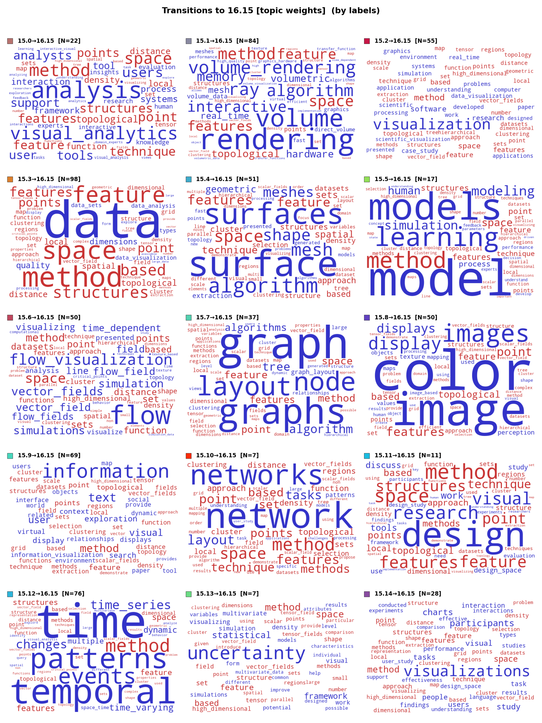
The analyst activates the Sankey transition view between ntopics = 15 and 16, combined with violin plots in split mode to assess membership confidence simultaneously. At ntopics = 16, a new "method" topic (shown in cyan) appears with 662 documents. The Sankey bands reveal that this topic collects method-related terms from multiple parent topics rather than emerging from a clean split of a single parent—a "wastebasket" pattern indicating conflated methodological vocabulary across unrelated research areas. The violin plots at ntopics = 15 show narrower, more concentrated distributions than at ntopics = 16, confirming higher membership confidence for the 15-topic solution.
Figure C.4: Sankey transition between ntopics = 15 (left) and ntopics = 16 (right) with violin plots in split mode. The new "method" topic (cyan, appearing at 16) draws thin bands from multiple parent topics—visual analytics, graph/network, rendering, and others—rather than splitting from a single parent. This many-to-one aggregation pattern is the hallmark of a wastebasket topic. The violins at ntopics = 15 are visibly narrower and more concentrated near the maximum, indicating higher membership confidence.
(This view is shown as Fig. 8 in the paper.)
Word Clouds: Sources of the "Method" Topic at ntopics = 16
To understand the composition of the wastebasket topic, the analyst examines word clouds for the documents that transitioned into it. The frequency-weighted view (left figure) shows which terms are most common among the contributing documents. The term-weight-change view (right figure) visualizes how term weights shift during the transition: word size encodes the magnitude of change, while color encodes direction—blue for terms losing weight (leaving behind their source-topic identity) and red for terms gaining weight (acquiring the destination topic's character). Together, the two views confirm that the "method" topic aggregates generic methodological terms (method, approach, technique, based, model) drawn from a variety of unrelated research areas.
Figure C.5 (freq): Frequency-weighted word clouds showing the sources of the "method" topic. Each cell represents one of the parent topics that contributed documents to the new 16th topic. Generic terms like based, method, model appear prominently across all contributing sources, confirming that the wastebasket topic does not have a distinctive thematic identity.
Figure C.5 (tw): Term-weight-change word clouds showing the sources of the "method" topic. Each cell shows vocabulary changes for documents moving from a specific parent topic (at ntopics = 15) to the new "method" topic (at ntopics = 16): word size encodes the magnitude of weight change; color encodes direction (blue = weight decreased in transition, red = weight increased). The mix of domain-specific terms (blue, losing relevance) and generic methodology terms (red, gaining relevance) confirms that the "method" topic conflates heterogeneous research areas through shared methodological language.
Word Clouds: Full 16-Topic Solution
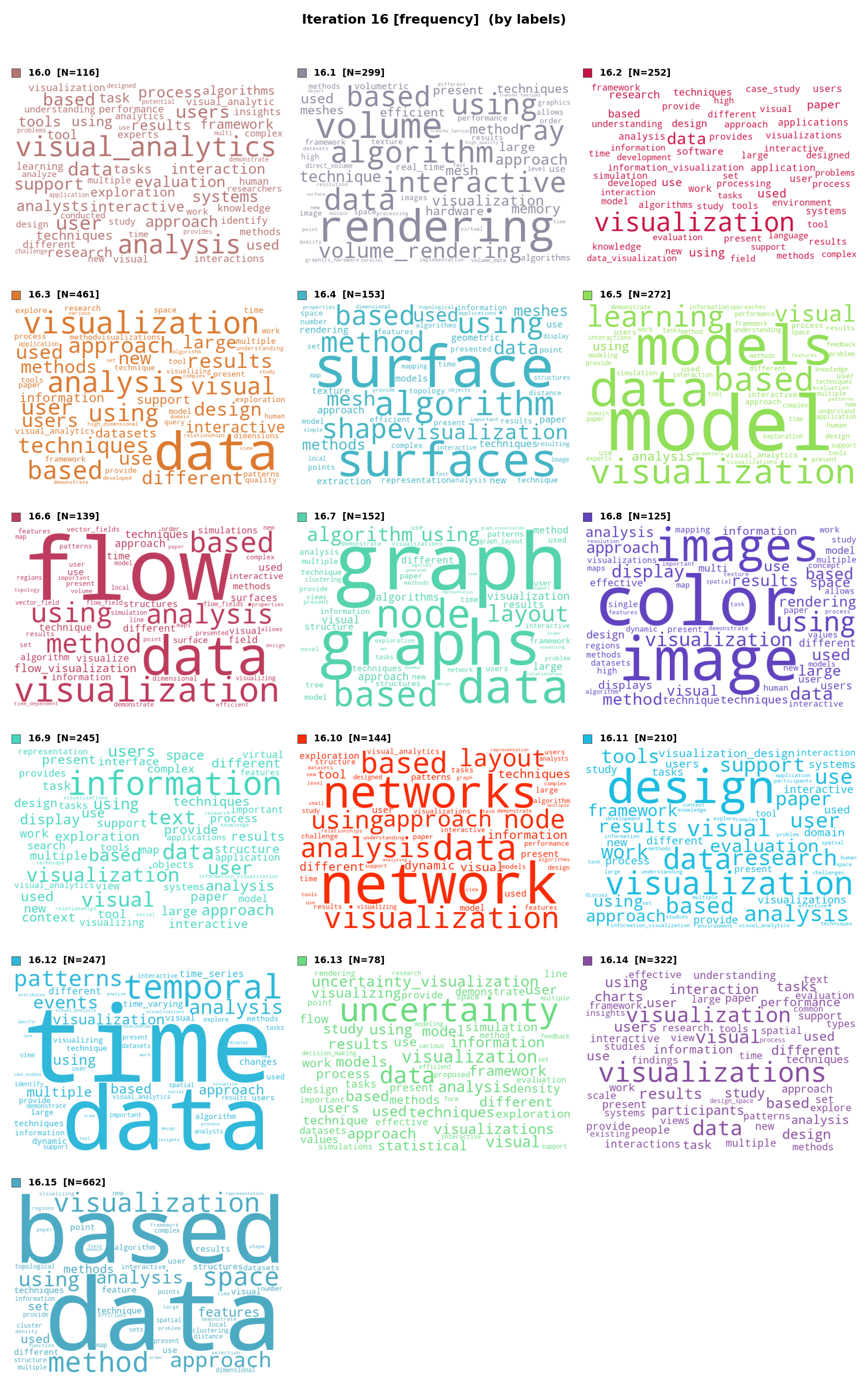
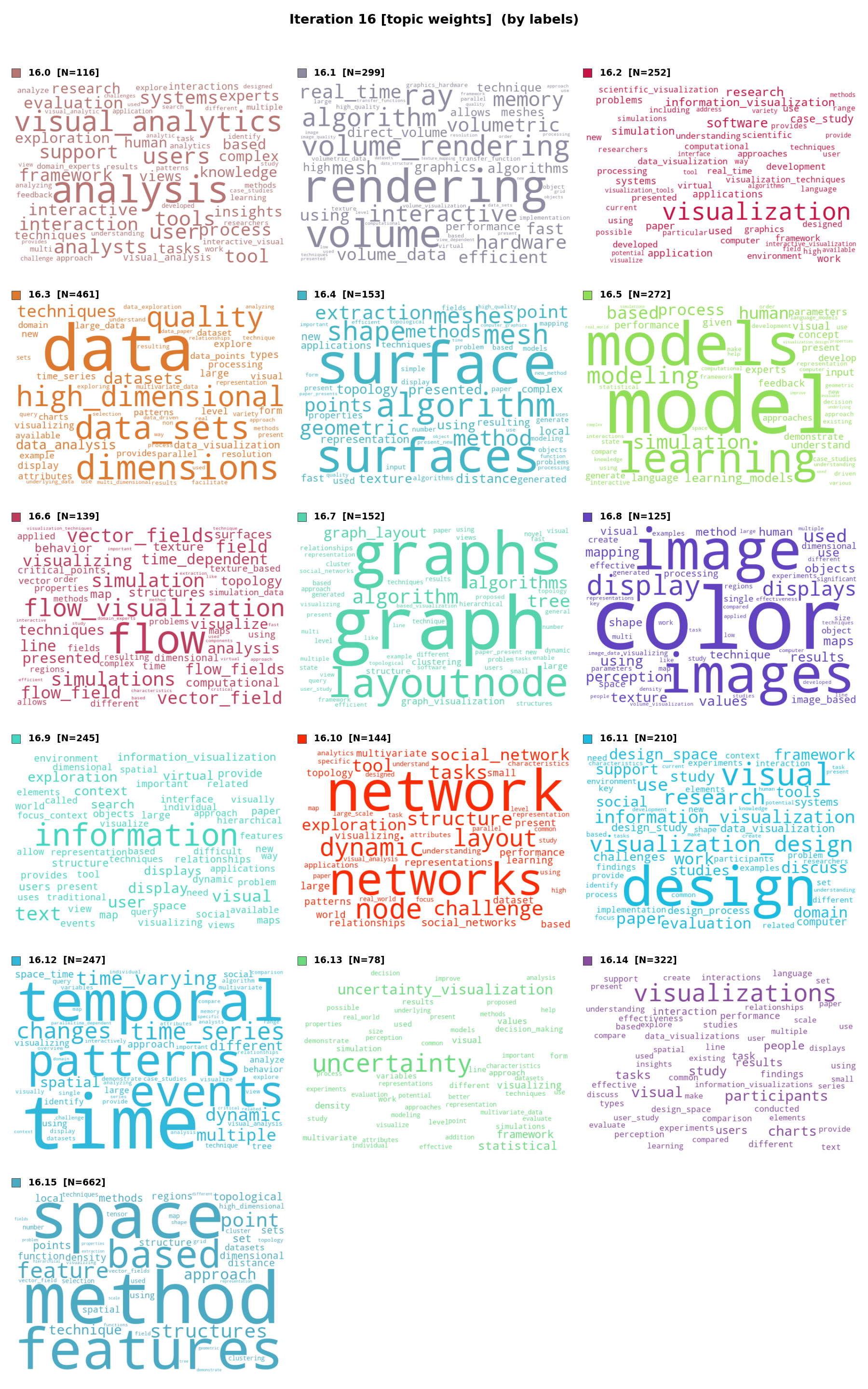
The complete 16-topic word-cloud display provides a broader view. While 15 of the 16 topics retain coherent, interpretable thematic profiles identical to those in the 15-topic solution, the additional "method" topic (typically in the bottom-right cell) lacks thematic focus. Its word cloud is dominated by terms that could belong to any research area, further confirming its role as a wastebasket that absorbs generic vocabulary without contributing interpretive value.
Figure C.6 (freq): Frequency-weighted word clouds for the 16-topic solution. The additional "method" topic shows a mix of generic terms (method, approach, technique) without thematic coherence, while the remaining 15 topics retain clearly distinct research profiles.
Figure C.6 (tw): TF-IDF-weighted word clouds for the 16-topic solution. Under TF-IDF weighting, the lack of specificity in the "method" topic becomes even more apparent: its most discriminative terms are still generic methodology vocabulary rather than domain-specific research concepts.
Word Clouds: Selected 15-Topic Solution
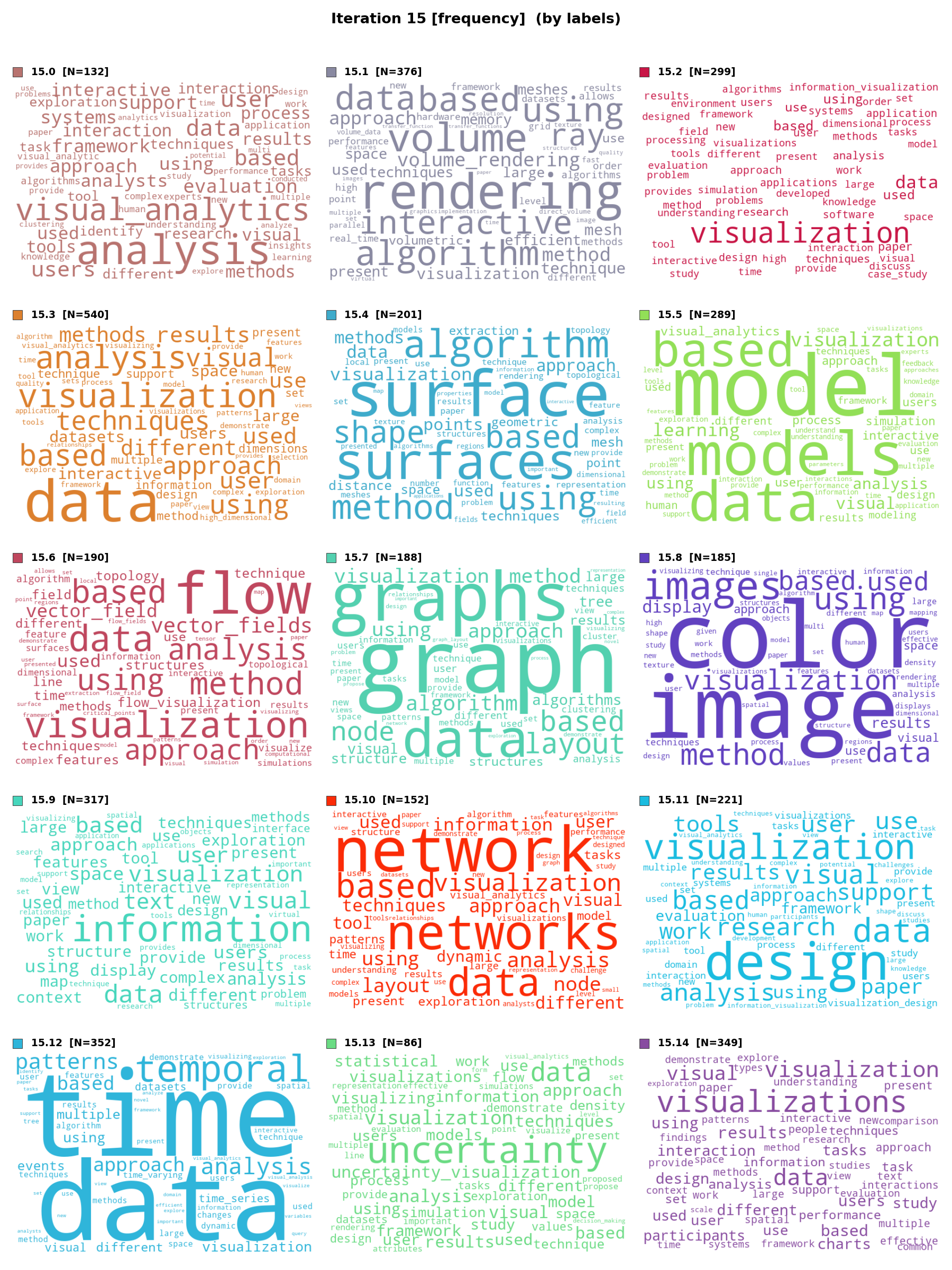
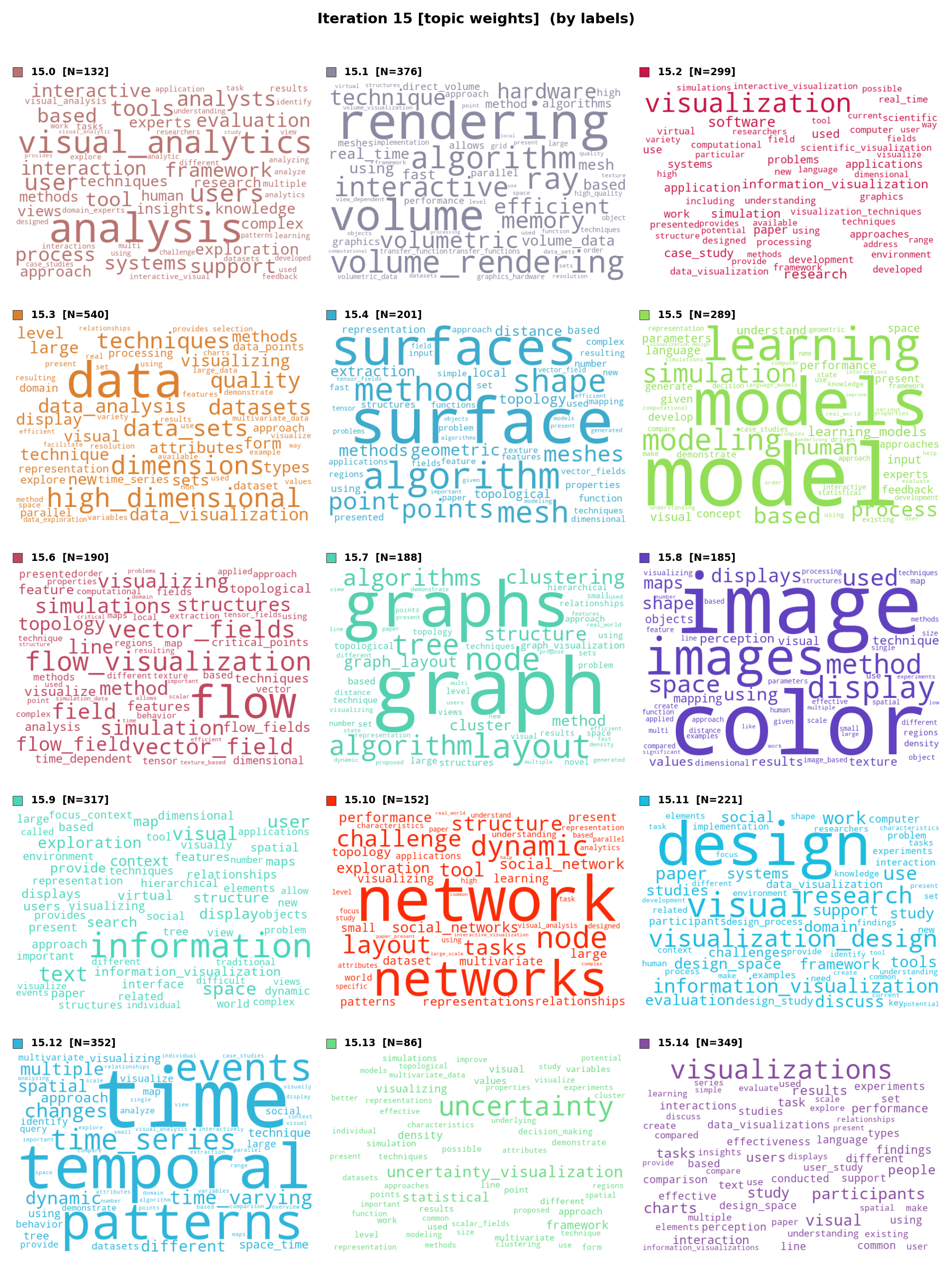
The final 15-topic solution produces clearly interpretable topics, each corresponding to a recognisable IEEE VIS research community. The frequency-weighted view (left) reveals the most commonly used terms within each topic, reflecting the vocabulary that practitioners in each area use most often. The TF-IDF-weighted view (right) highlights the most discriminative terms—those that best distinguish each topic from the rest of the corpus—providing a complementary lens for interpretation. Comparing the two views helps the analyst separate generic high-frequency vocabulary from the truly distinctive signature of each research theme.
Figure C.7 (freq): Frequency-weighted word clouds for the selected 15-topic solution. Each cell shows a coherent thematic profile. All 15 topics are clearly distinguishable and interpretable as established IEEE VIS research communities: visual analytics, graph/network, volume rendering, flow, user studies, colour/perception, high-dimensional data, text/document, temporal data, spatial/geographic, information visualisation, uncertainty, scientific visualisation, evaluation, and glyph/multivariate.
(This view is shown as Fig. 9, left, in the paper.)
Figure C.7 (tw): TF-IDF-weighted word clouds for the selected 15-topic solution. The TF-IDF weighting highlights the most discriminative terms per topic, making each topic's unique identity even sharper. For example, the graph/network topic elevates terms like node, edge, layout over generic terms like data or visual that appear across many topics.
(This view is shown as Fig. 9, right, in the paper.)
C.3 – Iteration 2: Investigating the "Time" Topic
Within the 15-topic solution, topic 12 relates to temporal data (top terms: time, temporal, series, event, sequence). The analyst notices that this topic becomes substantially smaller when moving from ntopics = 15 to 16, losing 106 of its 352 documents. This iteration investigates where these temporal papers migrate and what aspects of time-related research are absorbed by other thematic topics at higher granularity. Understanding this decomposition helps validate that ntopics = 15 is the appropriate level at which temporal research remains a coherent community rather than being fragmented across domain-specific topics.
IteraScope: Time Topic Behaviour Across Iterations
The IS display below focuses on the transition around the time topic. The Sankey view reveals that the time topic acts as a "hub" that progressively differentiates as ntopics increases: at low K, it encompasses all temporal research; as K grows, spatio-temporal papers migrate to the spatial topic, time-varying graph papers to the graph topic, and temporal event sequences to the event-analysis topic. At ntopics = 15, the time topic still holds these sub-communities together as a coherent whole; at ntopics = 16, the first major fragmentation occurs.
Figure C.8: IteraScope display focused on the time topic (topic 12). The Sankey bands between ntopics = 15 and 16 show that spatio-temporal papers from topic 15.12 migrate to the spatial topic, causing the time topic to shrink from 352 to 246 documents. This confirms that at ntopics = 15, temporal research forms a coherent community; at ntopics = 16, it begins to fragment along sub-domain lines as specialised aspects are absorbed by their corresponding thematic topics.
Word Clouds: Overall Transition from Time Topic (5.* → 15.12)
The first pair of word clouds shows the overall transition pattern to topic 15.12. The frequency view reveals which terms are most common among the documents that join the time topic, while the TF-IDF view highlights the most discriminative vocabulary of these migrating documents. Together, they confirm that the incoming papers carry time-related vocabulary (time, temporal, events, changes).
Figure C.9 (freq): Frequency-weighted word clouds showing the overall transition to the time topic (5.* → 15.12).
Figure C.9 (tw): Term-weight-change word cloud showing the overall transition to the time topic (5.* → 15.12). Word size encodes the magnitude of weight change; color encodes direction (blue = weight decreased, red = weight increased). Time-related terms appear prominently in red (gaining weight in receiving topics), confirming that temporal vocabulary is the primary factor driving reassignment to the time topic.
Word Clouds: All Destinations from Time Topic (15.12 → 16.*)
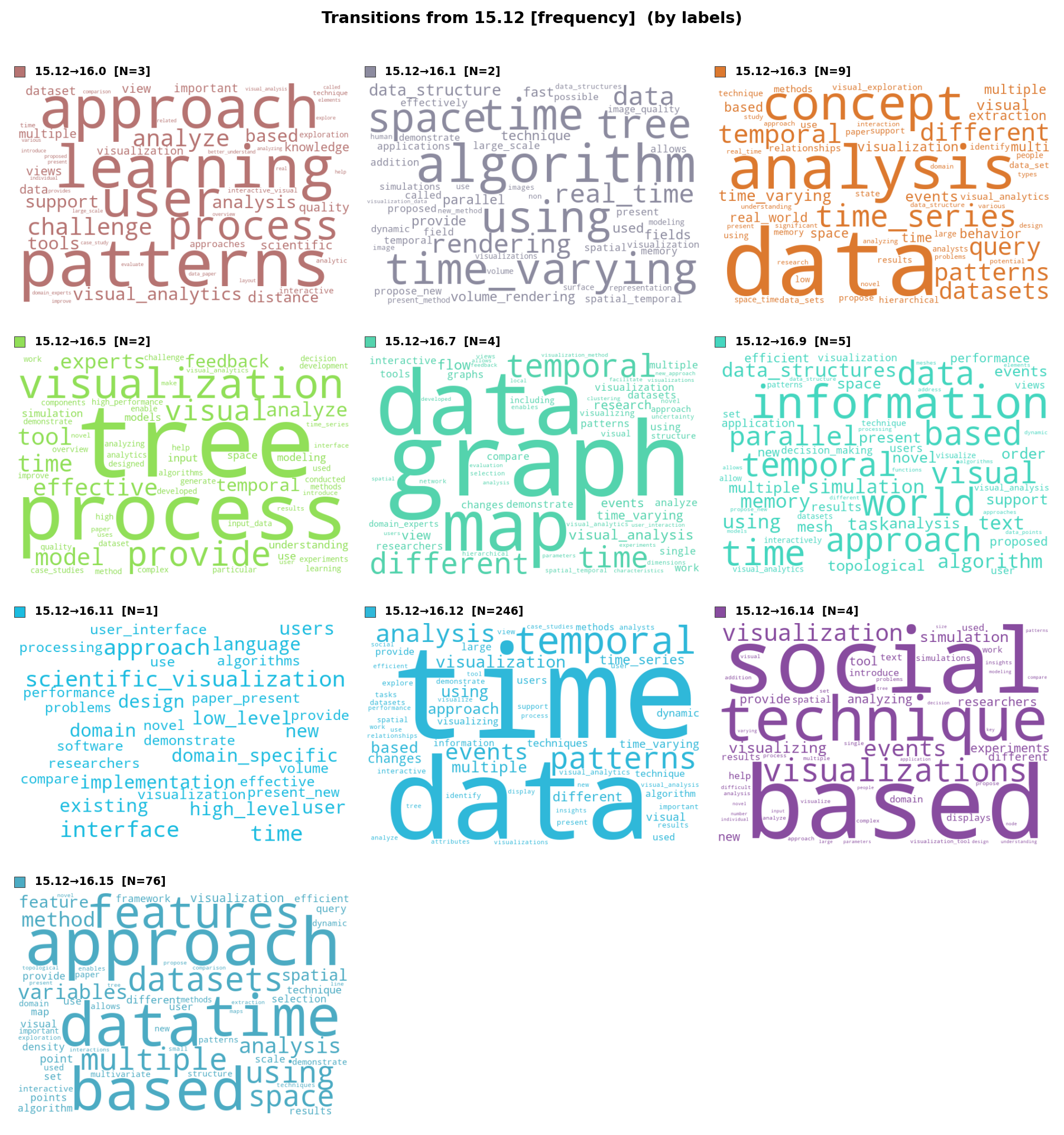
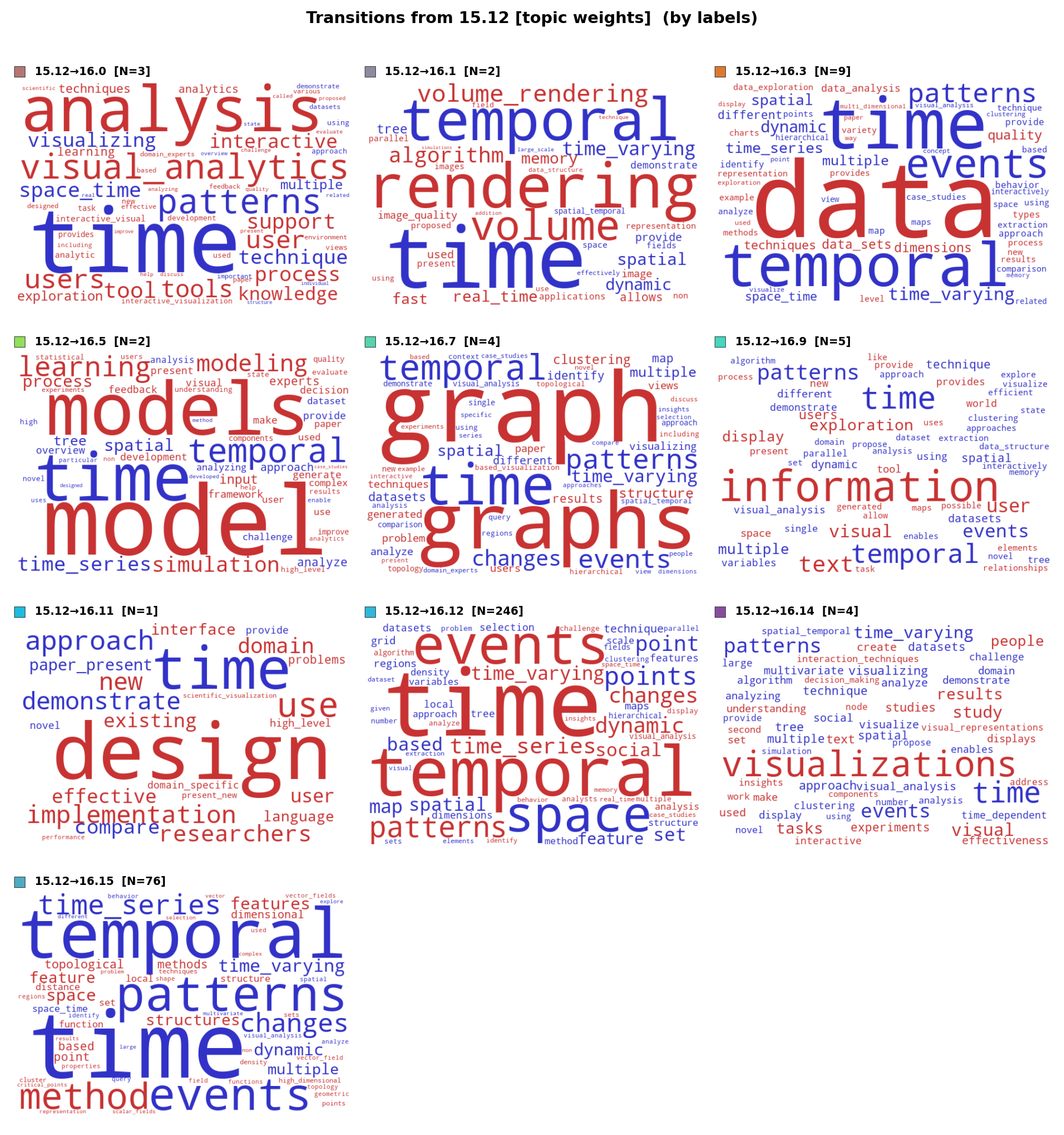
The second pair shows all destination topics for papers leaving the time topic at ntopics = 16. In the frequency view (left figure), each cell corresponds to a different destination. In the term-weight-change view (right figure), each cell shows how weights shift for that specific destination: size encodes magnitude, blue = terms losing weight, red = terms gaining weight. The multi-directional dispersal is evident: time-varying graphs move to the graph topic, temporal events to event-related topics, and streaming/dynamic data to analytics topics. This pattern confirms that the time topic at ntopics = 15 serves as an integrative hub for all temporal research.
Figure C.10 (freq): Frequency-weighted word clouds showing all destination topics for papers leaving the time topic at ntopics = 16. Each cell represents a different receiving topic. The diversity of destination vocabularies confirms multi-directional dispersal: time-varying graphs move toward graph/network vocabulary, spatio-temporal papers toward geographic terms, and temporal event sequences toward interaction/event terms.
Figure C.10 (tw): Term-weight-change word clouds showing all destination topics for papers leaving the time topic. Each cell corresponds to one receiving topic at ntopics = 16; word size encodes magnitude of weight change, color encodes direction (blue = decreased, red = increased). The red terms in each cell align with the receiving topic's thematic identity (e.g., graph terms for the graph destination, model terms for the modeling destination), confirming domain-specific absorption rather than random redistribution.
Word Clouds: Spatio-Temporal Paper Migration (Detail)
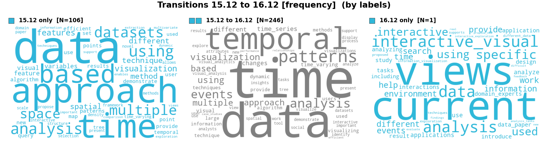
The third pair provides a detailed view of the largest single outflow from the time topic: the 106 spatio-temporal papers assigned to topic 15.12 (time) but not to topic 16.12. These papers combine spatial and temporal analysis—covering trajectories, movement patterns, space-time cubes, and geographic event sequences. At ntopics = 15, their temporal vocabulary keeps them within the time topic; at ntopics = 16, their equally strong spatial vocabulary pulls them toward the spatial/geographic topic. The frequency view (left figure) shows term prevalence among these 106 papers. The term-weight view (right figure) uses a three-panel layout: source weights (left panel, cyan), destination weights (right panel, cyan), and weight changes (center panel—size encodes magnitude, blue = decrease, red = increase). This makes the dual identity concretely visible: temporal terms shrink while spatial terms grow.
Figure C.11 (freq): Frequency-weighted word clouds for the documents exclusive to topic 15.12 (time) that are not retained in topic 16.12.
Figure C.11 (tw): Term-weight word clouds for the documents exclusive to topic 15.12. Three panels: left—term weights in topic 15.12 (source, cyan); right—term weights in the topic at ntopics = 16 (destination, cyan); center—weight changes from source to destination, where size encodes magnitude and color encodes sign (blue = decrease, red = increase).
(This view is shown as Fig. 10 in the paper.)
C.4 – Iteration 3: Temporal Prevalence Analysis
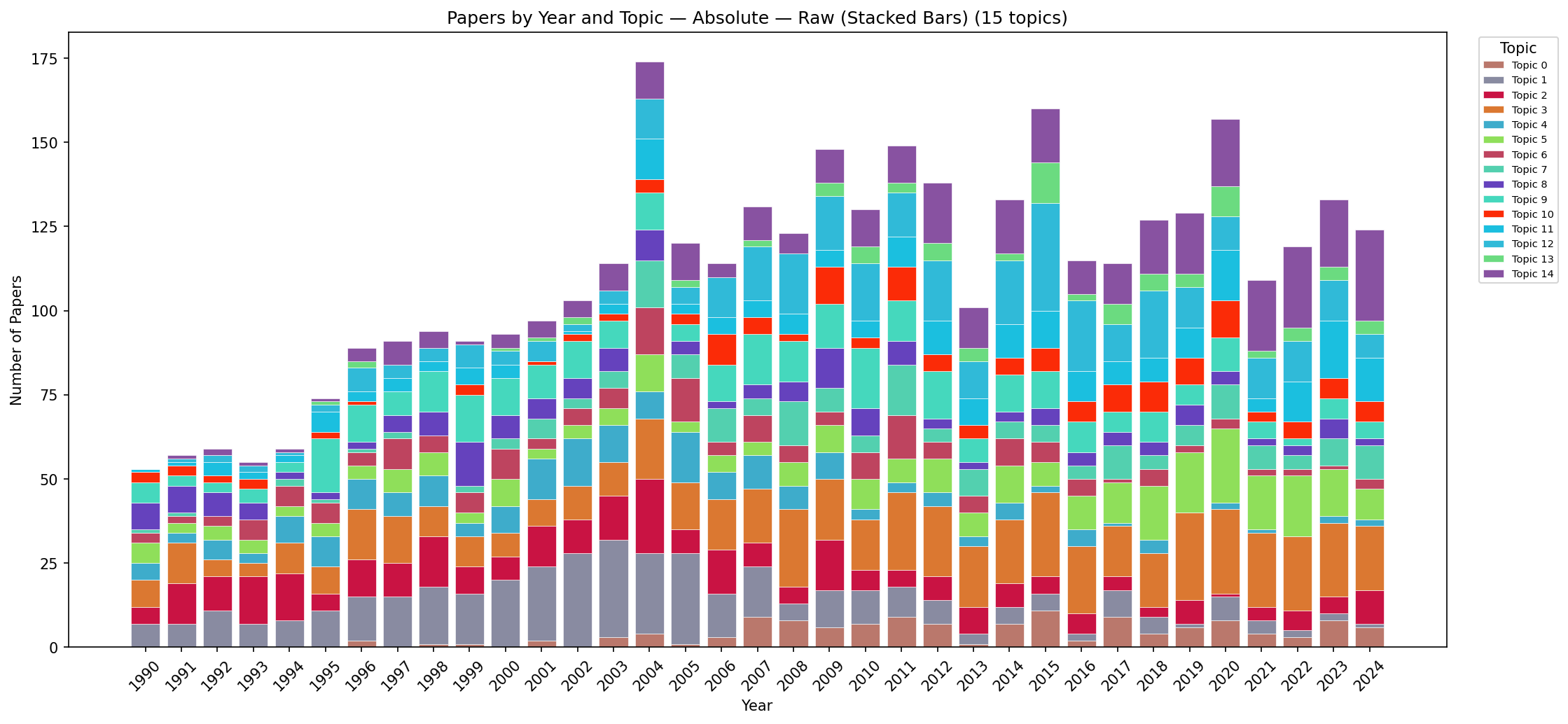
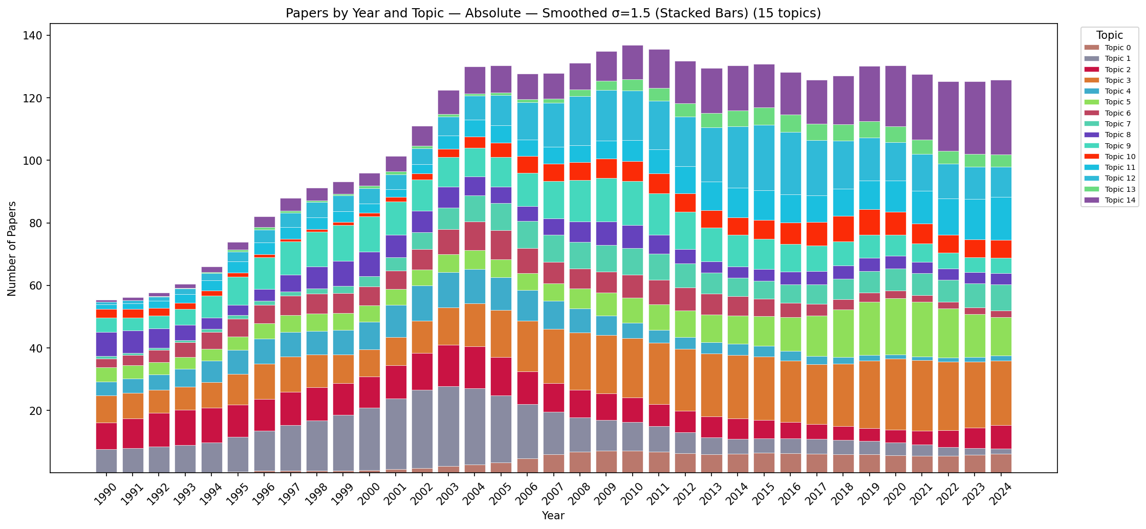
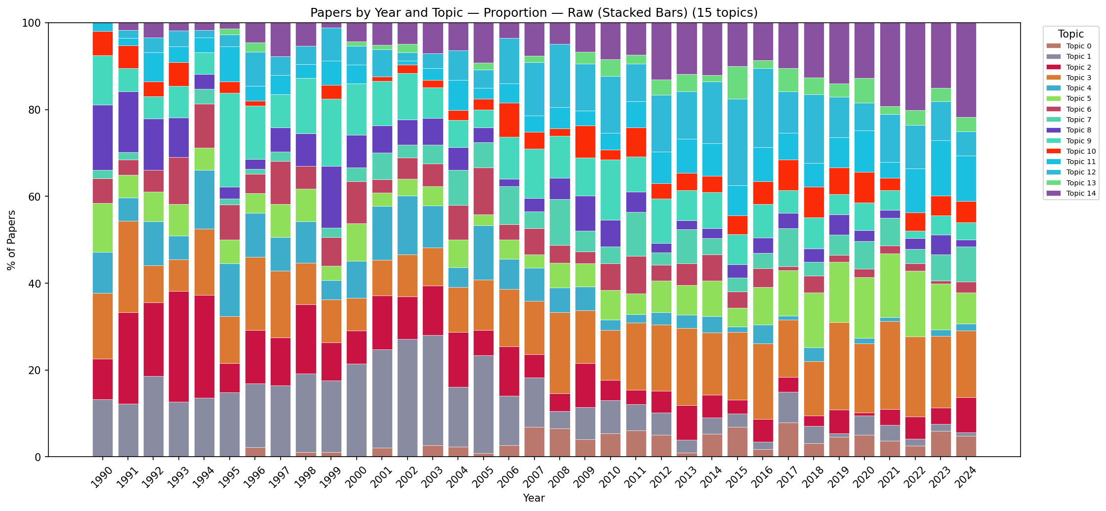
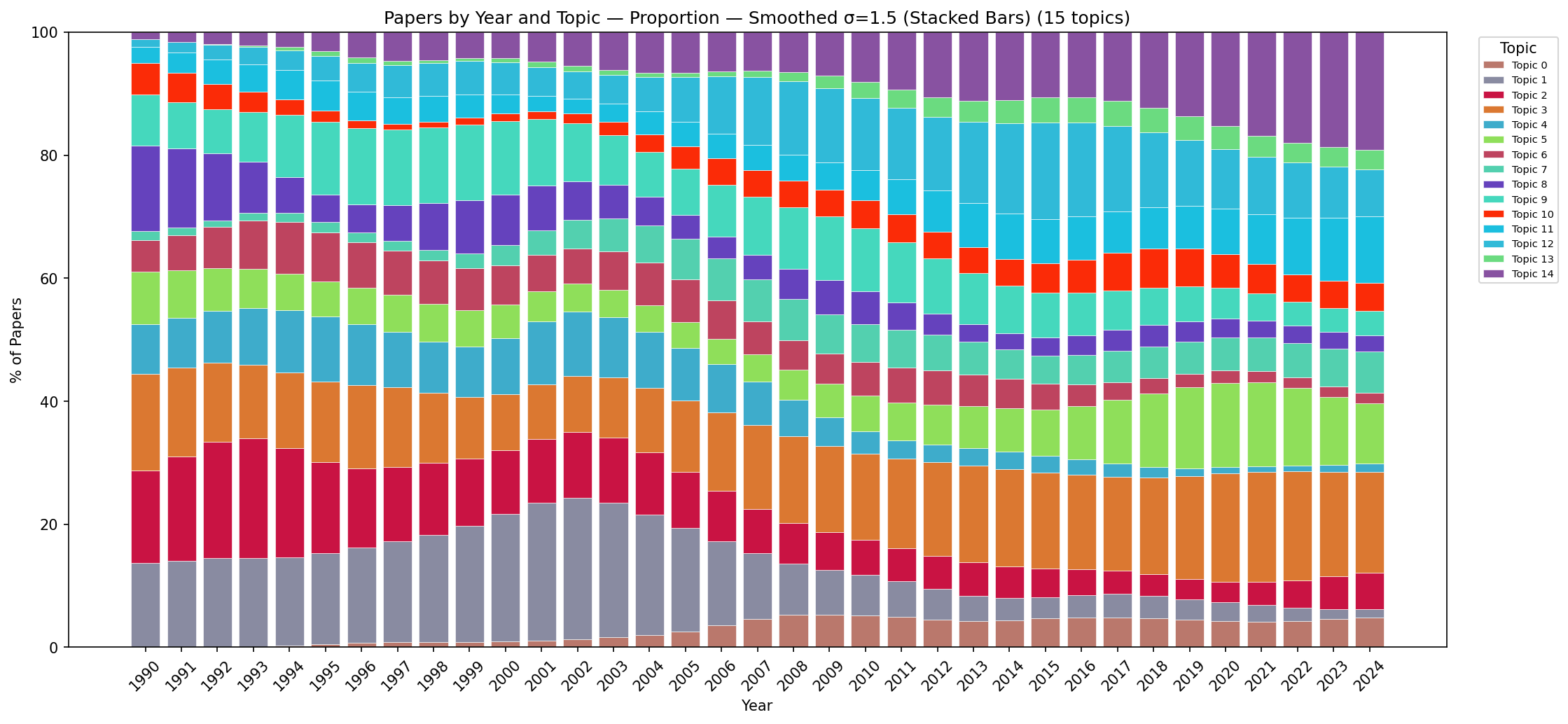
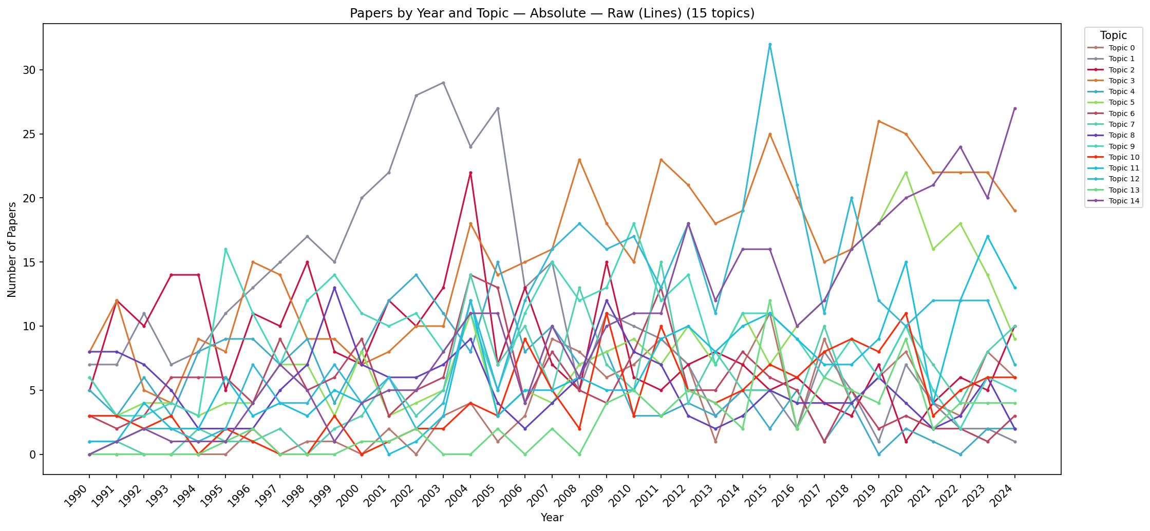
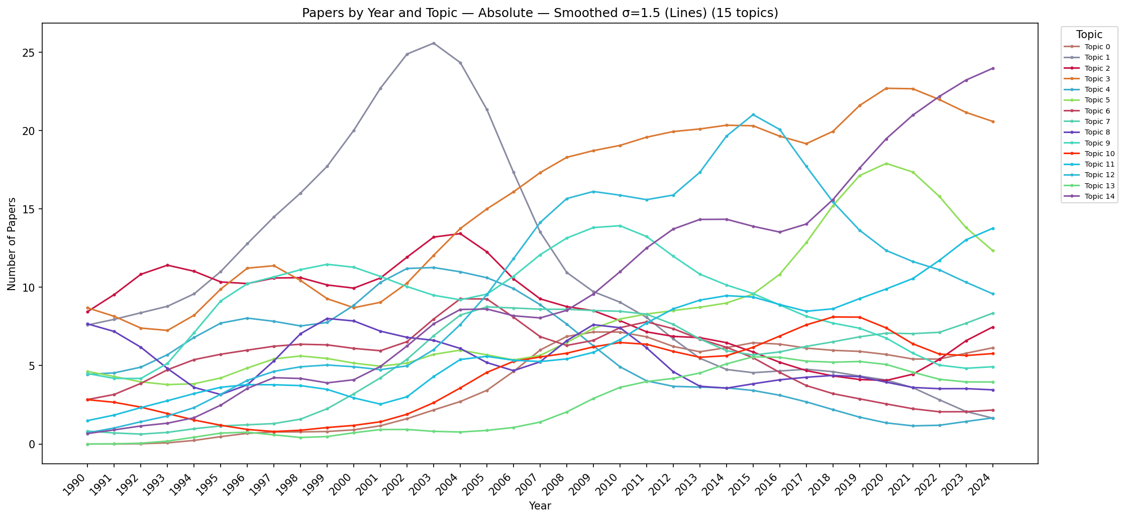
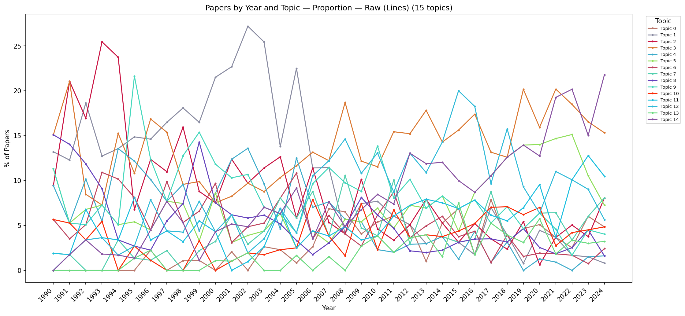
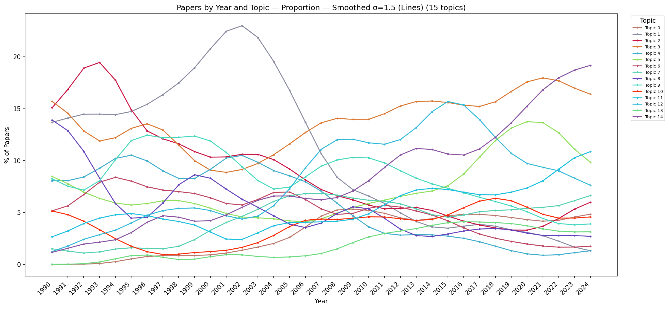
To interpret the 15-topic solution in the context of the IEEE VIS community's evolution over 34 years (1990–2024), the analyst aggregates papers by their dominant topic and publication year. Eight alternative visualisations are produced, combining two chart types (stacked area vs. line), two quantity types (absolute count vs. proportion per year), and two smoothing options (raw data vs. Gaussian smoothing). Together, these views reveal clear long-term trends in the research landscape that would be invisible in any single-year snapshot.
Key findings:
Visual analytics (topic 0): emerged ~2004, stabilised at ~15% share since 2007—coinciding with the establishment of the VAST conference track as a distinct venue for analytical reasoning research.
High-dimensional/multivariate data (topic 3): remarkably constant ~8–10% share across the entire 34-year span, reflecting the enduring importance of dimensionality reduction and multivariate visualisation as foundational challenges.
User studies and evaluation (topic 14): steep, sustained increase from <5% (pre-2005) to ~20% (by 2024), reflecting the community's growing emphasis on rigorous empirical methodology and evidence-based design.
Volume rendering (topic 1): gradual decline from dominant shares in the 1990s to <5% in recent years, as the community broadened from its scientific-visualisation origins toward information visualisation and visual analytics.
These trends are consistent with known shifts in the VIS research landscape and demonstrate that the discovered topics capture genuine, temporally coherent research communities rather than statistical artefacts. The fact that temporal patterns align with known historical events (VAST track founding, growth of HCI-oriented evaluation culture) provides external validation of the topic model's quality.
Stacked Area Charts
Stacked area charts show how the total publication volume is distributed among topics over time. The absolute-count versions reveal overall growth in the field, while the proportional versions isolate relative shifts between topics (controlling for the increasing number of papers per year). Gaussian smoothing removes year-to-year fluctuations caused by small sample sizes in early years and conference-cycle effects.
Figure C.12: Stacked area chart showing absolute paper counts per topic per year (raw data). The overall increase in publication volume is visible—from ~30 papers/year in 1990 to ~200/year by 2024—along with the emergence of new topic colours (e.g., visual analytics appearing post-2004).
Figure C.13: Stacked area chart showing absolute paper counts per topic per year (Gaussian-smoothed). Smoothing removes year-to-year fluctuations, revealing the underlying growth trends more clearly. The visual analytics and user-study bands show steady monotone growth; the volume-rendering band shows steady decline.
Figure C.14: Stacked area chart showing proportional topic shares per year (raw data). The shift from scientific-visualisation dominance in the 1990s toward visual analytics and user studies in the 2010s–2020s is visible despite year-to-year noise. Early years show more variability due to smaller publication counts.
Figure C.15: Stacked area chart showing proportional topic shares per year (Gaussian-smoothed). This is the clearest view of long-term trends: the rise of visual analytics post-2004, sustained growth of user studies, decline of rendering topics, and stable share of high-dimensional data analysis. The smooth curves allow confident identification of trend inflection points.
(This view is shown as Fig. 12 in the paper.)
Line Charts
Line charts provide a complementary view where individual topic trajectories can be traced independently without the stacking effect that can obscure trends in lower layers. They are particularly useful for identifying crossing points (when one topic overtakes another in prevalence) and for comparing growth rates between specific topics of interest.
Figure C.16: Line chart showing absolute paper counts per topic per year (raw data). Individual topic trajectories are easier to trace than in stacked views, though overlap among similarly-sized topics can obscure readings. The dominance of volume rendering in early years and visual analytics in later years is immediately visible.
Figure C.17: Line chart showing absolute paper counts per topic per year (Gaussian-smoothed). Growth trajectories become clearly distinguishable: visual analytics and user studies show monotone increase; volume rendering and flow visualisation show decline; high-dimensional data maintains a flat trajectory.
Figure C.18: Line chart showing proportional topic shares per year (raw data). Relative trends are visible but noisy—particularly for years with fewer total publications (early 1990s), where a single paper more or less can shift a topic's share by several percentage points.
Figure C.19: Line chart showing proportional topic shares per year (Gaussian-smoothed). This view best reveals crossing points where research priorities shifted: visual analytics overtakes volume rendering around 2005; user studies overtake flow visualisation around 2008; the high-dimensional data line remains remarkably flat throughout.
Summary of the Analytical Process
The table below summarises the four iterations of the topic-modelling workflow, showing how each iteration addressed specific analytical questions and built upon previous findings. The process illustrates the iterative, human-guided nature of the SI workflow: each round's findings inform the questions posed in the next round, progressively deepening the analyst's understanding of the corpus structure.
Iteration
Focus
Workflow Phase
Key Finding
0
Data quality check
Phase 0 (preprocessing)
283 papers contain <<ETX>> artefacts causing a spurious stable topic; removed before further analysis. Demonstrates how the SI workflow can surface hidden data-quality issues.
1
Topic count selection (ntopics = 5…25)
Phases 1–3
~15 stable archetypes emerge; ntopics = 16 introduces a "method" wastebasket topic that collects generic vocabulary from multiple parents; ntopics = 15 selected for coherence and membership confidence.
2
Time topic investigation
Phase 4 (domain validation)
Temporal research forms a coherent hub at ntopics = 15; at higher K, 106 spatio-temporal papers (with vocabulary like spatial, space-time, trajectory) disperse to domain-specific topics, validating ntopics = 15 as the integration level.
3
Temporal prevalence analysis
Phase 4 (temporal context)
Clear 34-year trends validated: VA rise post-2004, user-study growth to ~20%, rendering decline, stable high-dimensional data share. Alignment with known historical events provides external validation.
Final selected configuration: NMF with ntopics = 15. This produces 15 coherent, interpretable research themes that are stable across the parameter sweep (~89% non-noise archetype instances), exhibit high membership confidence (narrow violin distributions), and show temporally valid prevalence patterns consistent with the known evolution of the IEEE VIS community over 34 years. The 16-topic alternative was rejected because its additional topic acts as a methodological wastebasket rather than a genuine research community.
 01_20260508_121910 5-25.png)
 01_20260508_122719 5-25.png)
 01_20260508_122719 5-25.png)
 01_20260508_122719 5-25.png)

 01_20260508_122719 5-25.png)